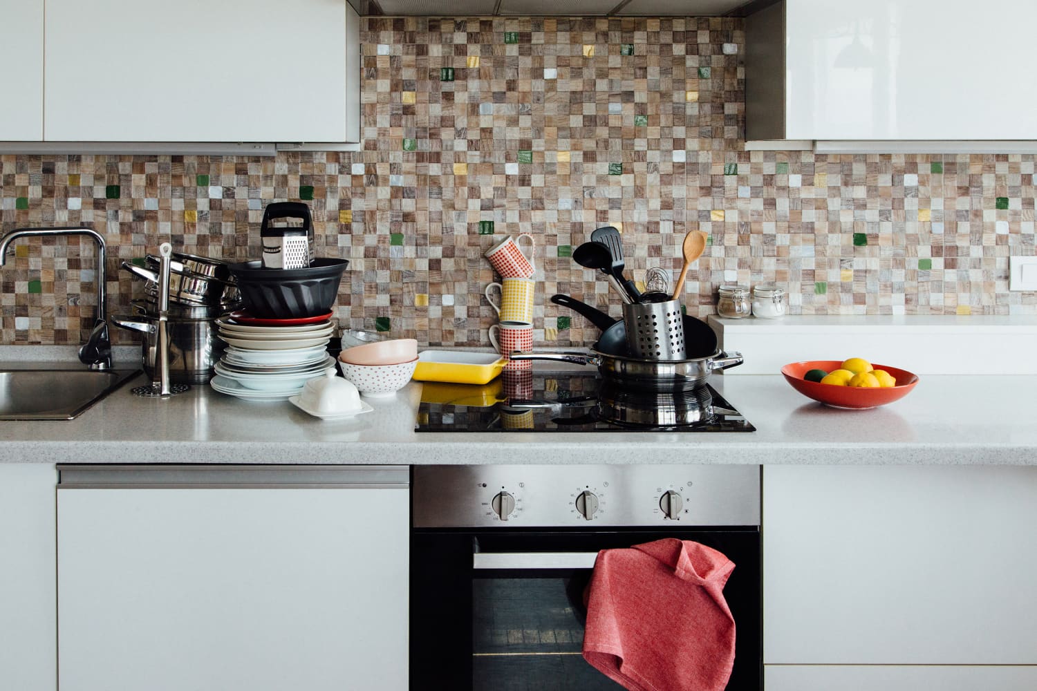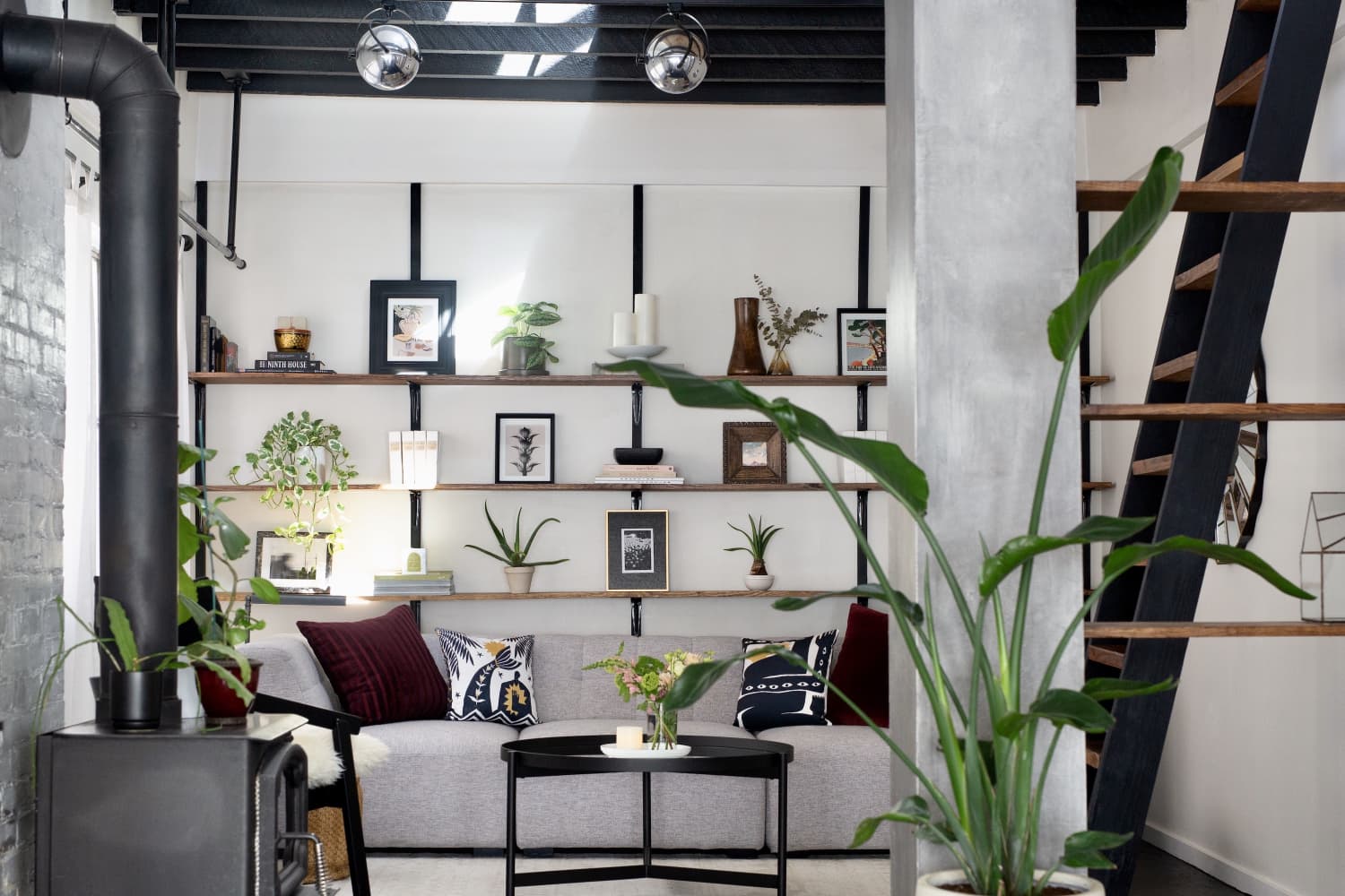
Of all the rooms in my small rental apartment, I knew I was going to put most of my DIY energy into my kitchen. As someone who enjoys baking, hosting, and having a kitchen that feels like part of the home, it was important that every detail in the space came back to these foundations and captured my style. While the gallery wall I created and the removable tile flooring I installed set an immediate design tone that achieved my vision, I missed the mark just a bit when it came to deciding to place faux marble peel-and-stick contact paper on my countertops.
Was it the installation? The way the contact paper’s white and gray tone didn’t blend quite right with the rest of my kitchen? The removal process? It may or may not have been all of the above. Don’t get me wrong — I love a project, and love a design risk even more. But this one specifically taught me an important lesson: Customizing every part of a rental isn’t always necessary.
Before the contact paper went down, my kitchen countertop surface had a speckled, multi-toned brown meant to mimic marble. It wasn’t terrible on the eyes, but I felt I could find something more aligned with my painted olive green walls and subway tile backsplash. The latter came with the apartment, and what a feature it was!
After unwrapping the gray-and-white contact paper I decided to order, the installation — along with the frustrations — began. If I didn’t apply and push the paper down slowly enough, it meant air bubbles. If I didn’t align the paper perfectly with the edge of the last strip I put down, it meant exposed countertops or overlapping paper. Even though it was tedious work with lots of room for error, I’m glad I gave myself a full afternoon to install. It ultimately looked good after all was said and done, as long as you weren’t close enough to see those air bubbles or overlaps.
The Bigger (Style) Picture
It didn’t take long for me to realize that my chosen contact paper wasn’t the one. I truly felt like I was onto something with the gray-and-white tone I went with, thinking it would fit right in among the white tile backsplash, white baseboard molding, and the (unappealing) white appliances my apartment came with. While it helped with brightening my kitchen, it was too much of one color that overpowered the tile flooring, painting, and gallery wall I worked so hard on.
The balance was noticeably off, and I only wish I had given the original countertops a chance before deciding to change their appearance. Those installation hiccups came back to bite the design, too. The air bubbles ended up popping, which resulted in very visible rips and patches of exposed countertops.
The Removal and Reflection
The time eventually came to remove the contact paper. It was certainly a quicker process to pull the paper off than it was to put it down, but it left behind an unpleasant amount of residue that required lots of upper body strength and baking soda to scrub off.
While my arms recovered from soreness, I reevaluated my entire perspective on not just peel-and-stick makeovers, but also DIY projects in general within rental spaces. I learned there’s a careful balance to find between not overdoing it design-wise in a place you won’t be living in long-term, and still putting in the effort to make it uniquely yours — which you can do without customizing every last detail!
With the next kitchen countertop I meet, I’ll be taking a beat before I decide if it needs to be revamped and match every last detail in the kitchen. Patience is underrated when it comes to curating your home (no matter if you rent or own), and sometimes the best features are already right in front of you.
NB: Ratingmania is a place to find the finest discounts on the internet and all the necessities.
Source url www.apartmenttherapy.com
Ideas & Inspiration,News,Rentals,Styles & Trends,team:style,platform:homepage,platform:social


