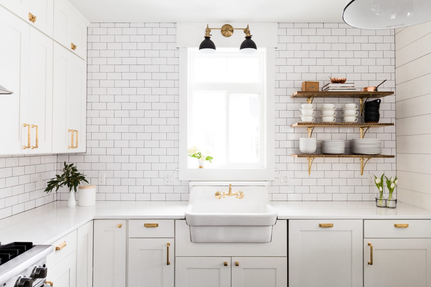
When it comes to decorating, peel-and-stick tile is a crowd favorite among renters and owners alike — and for good reason. It’s durable, easy to install and uninstall, and makes a big design impact on your space without totally breaking the bank. I’m part of the peel-and-stick tile club myself, having used it on my kitchen backsplash in my last apartment (Scout’s honor: It held up great and was very easy to remove!).
When you think of peel-and-stick tile, though, you likely think of it being used in kitchens and bathrooms or maybe even on a fireplace. But there’s one spot you probably haven’t seen it used before, and if you’ve ever dealt with this eyesore of a feature in your home, you’re going to love this application idea and want to copy it immediately.
During their recent “Design Dilemmas” question and answer session on the Apartment Therapy community forum, Jordan Slocum and Barry Bordelon, aka The Brownstone Boys, encouraged readers to think outside the typical uses for this rental-friendly material. To that end, they referenced one of their design projects, where they installed peel-and-stick tile on an architectural column of a rental home.
This suggestion of “tiling” a column should come as no surprise, considering Jordan and Barry are known for their love of designing homes with quirks and charm. But I’d say this idea reaches an extra level of ingenuity, thanks to its budget-friendliness, resourcefulness, and general reversibility.
Many people have a weird corner or an architectural feature that juts out awkwardly into space, interrupting the flow and look of a room. Instead of leaving these eccentricities plain and untouched, why not flip the script on those details by highlighting them in a stylish way, as the Boys did here?
Pro tip: Consider starting with something from their suggested brand, Wallpops, which stocks a variety of “tile” colors and patterns. You won’t even need that much “tile” to cover the whole column surface, so this project shouldn’t set you back too much. I personally love how this black glossy “tile” pops against the matte-like finish of the limewash walls in this room, effectively turning the column into a fun focal point versus a funky eyesore.
Just when I thought peel-and-stick tile had been exhausted of all its design possibilities, The Brownstone Boys proved there’s always a little more room for creativity. If you’re feeling inspired, consider tackling this DIY yourself and share the result in our new community forum. And visit later today for the next installment of our “Design Dilemmas” series with licensed therapist turned interior designer and home wellness expert Anita Yokota.
NB: Ratingmania is a place to find the finest discounts on the internet and all the necessities.
Source url www.apartmenttherapy.com
Decorating,Design,DIY,Ideas & Inspiration,style,Styles & Trends,team:style,platform:newsfeeds,platform:social


