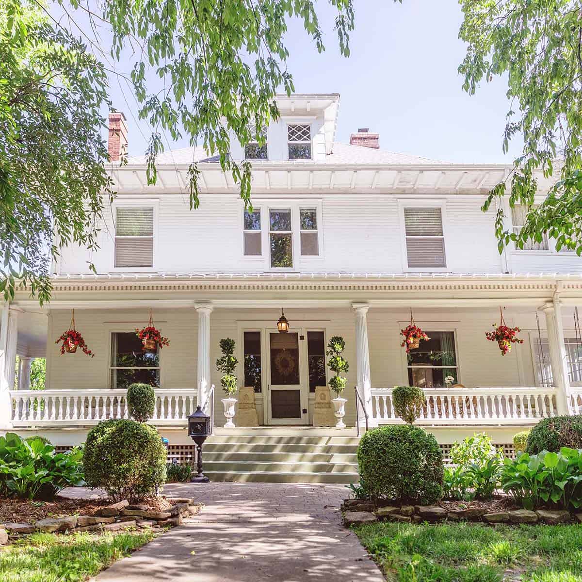
This past month, we celebrated one year since we moved into our historic dream home. Today, I’m so excited to share a lengthy tour of most of the rooms in our home and the decor we’ve been adding. I am embracing a slow renovation for this home. I expect it may take five to 10 years to complete all the renovations I have planned, but for once in my life, I am in no rush.
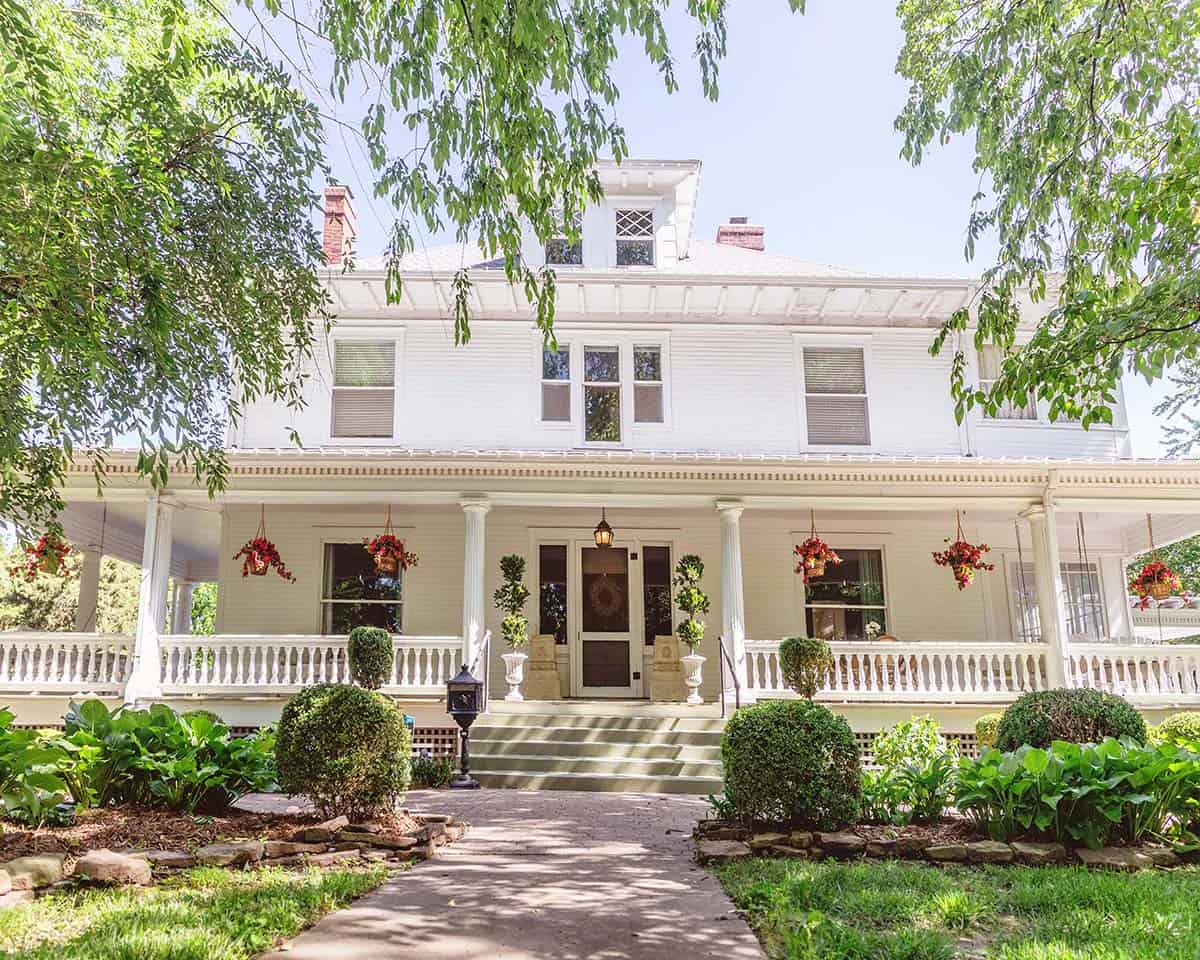
Let’s begin with the exterior. I have always oohed-and-ahhed over this home for as long as I can remember (since high school age when I first got my driver’s license). I have always had feelings about this home, so when we decided to move back to our hometown we wrote a letter to the owners asking if there was any chance they would sell and they did. We feel incredibly lucky and never looked at any other homes. She’s the one!
The one hesitation I had about this home was that the interior was heavily renovated in a modern way. I wish it had come with more original character, so we vowed to prioritize adding as much antique charm as possible. Recently, we hosted a home tour with hundreds of local people walking through our home. I was so happy that many people assumed the antique-inspired renovations we have done were original to the home. That remains my biggest goal!

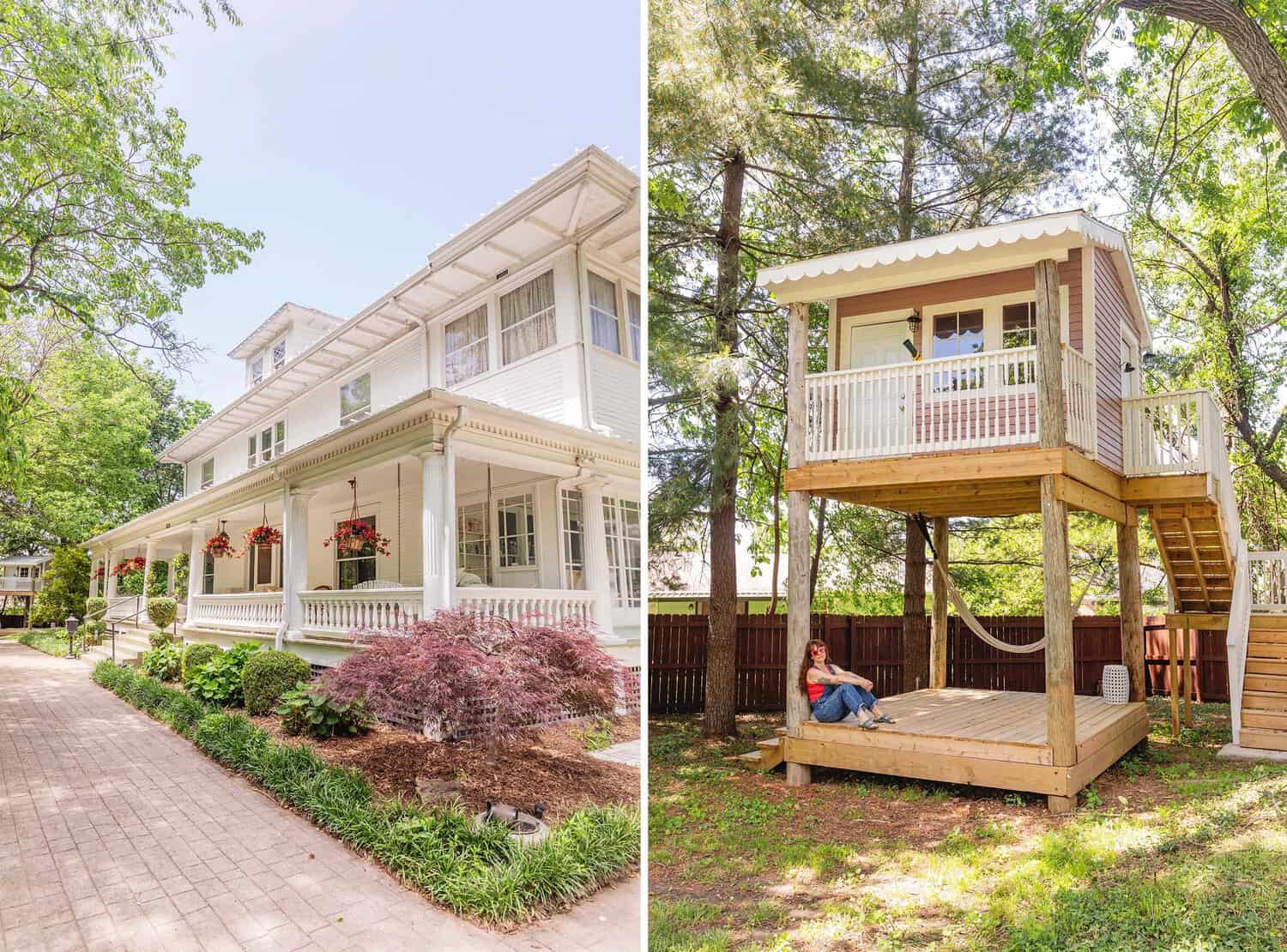
Porches – Porches are so romantic to me! I love having my morning coffee on the porch or watching the kids run around with fireflies. It’s the perfect place for popsicles and Halloween decorations alike.
Playhouse – We added a playhouse. It’s actually in our front yard (you can see it in the corner of the first pic above). We have a large lot and a ton of trees and our house is very set back from the street (so it is charming and not obtrusive). But I will say, it’s the most I’ve ever enjoyed not having an HOA. I can’t wait to decorate the playhouse for Halloween and Christmas.

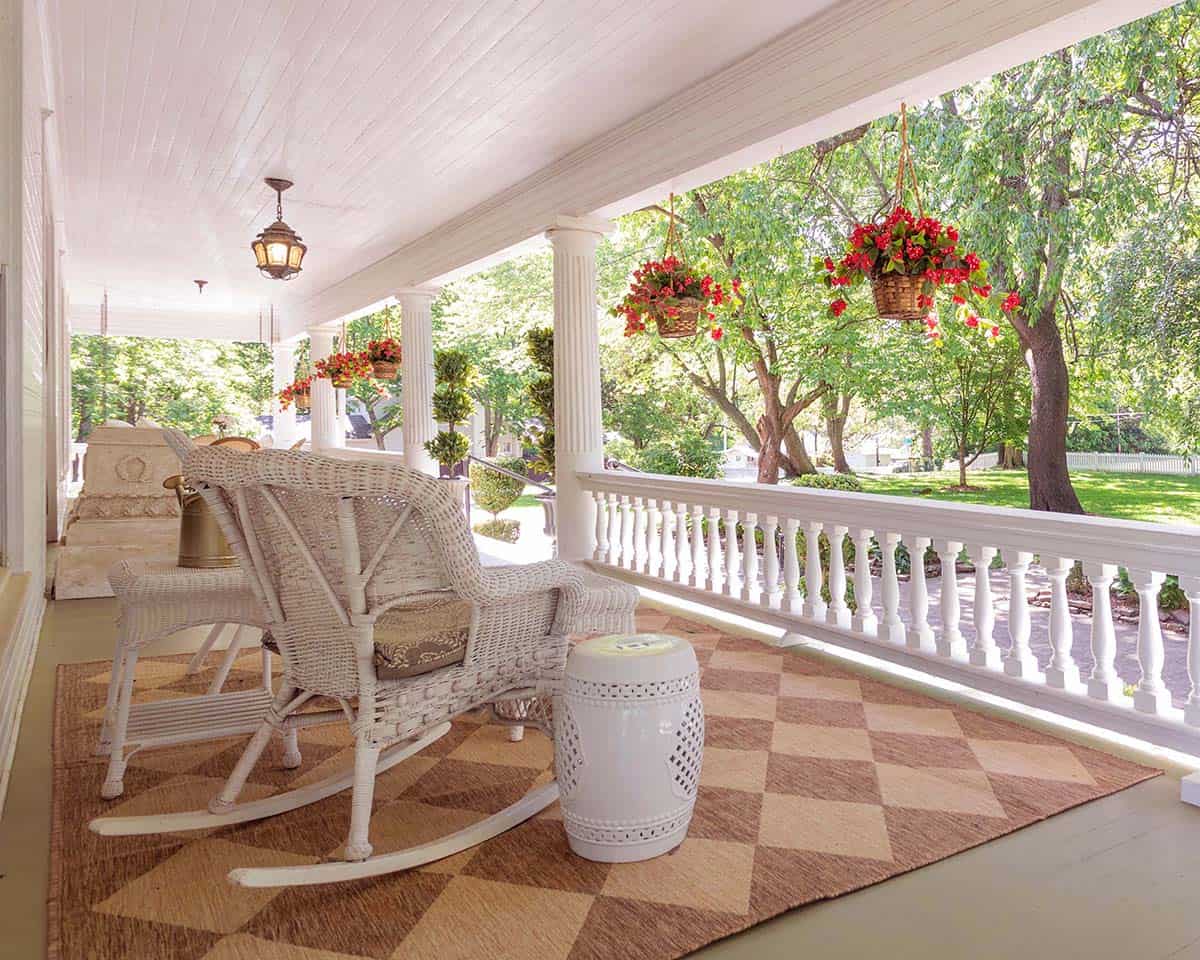
Landscaping – In this photo, you can see a bit of our front yard. We’ve worked really hard on the yard since owning this home. I’ll have to show you more in the future. Last fall, we added two apple trees, two cherry trees and a fig tree. We are planning to make a few improvements each year until it’s our perfect secret garden space.
We added a magnolia tree as I was reading Magic Lessons at the time and I became obsessed trying to incorporate inspiration from the book into my home.

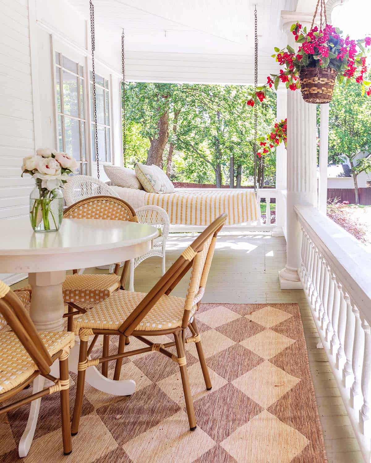
Daybed Swing – People always ask us if we really use the hanging daybed and the answer is yes, all the time. My husband likes to sneak out there to watch baseball on his phone and I snuggle the girls there all the time. Our favorite time to lay on the daybed is when it’s raining outside.
Sources: Patio Rug, Round Table, Bistro Chairs, Hanging Plant (similar), White Chairs.

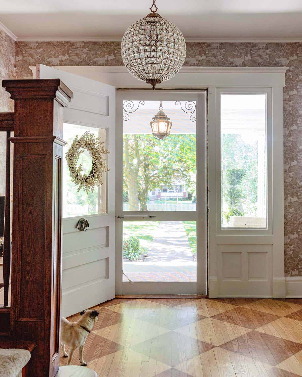
Entry – From this angle, you can’t see that the other side of the door is a warm pink, but you can see my bat door knocker. And our cute little pug, Pumpkin.

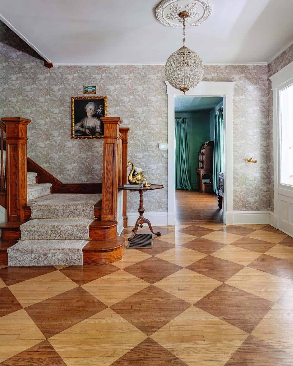
Diamond Wood Floors – I’m SO glad we chose the two-tone floors. I will be honest, I was nervous! I LOVE how they turned out. The dark color is the color for our entire home and the light color is used on in this space for the pattern. They were done by a wood floors company at the same time we refinished the floors throughout the home.
For the round crystal chandelier, we found it from Pottery Barn. It looks just like an antique (with much simpler install). We ended up using the smaller size in the entry and the larger size at the top of the stairs.

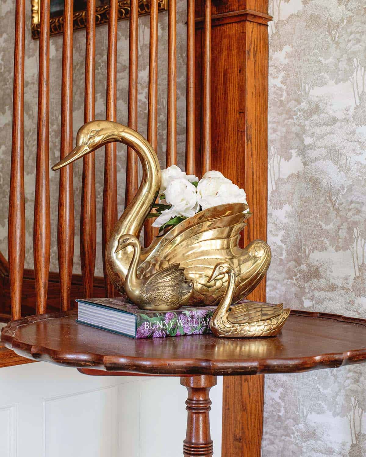
Swans – I have started many vintage and antique collections since moving to this home. Swans are a big one. I love how they are both beautiful and creepy. I collect a lot of brass items including candlesticks, butterflies, bells and boxes.

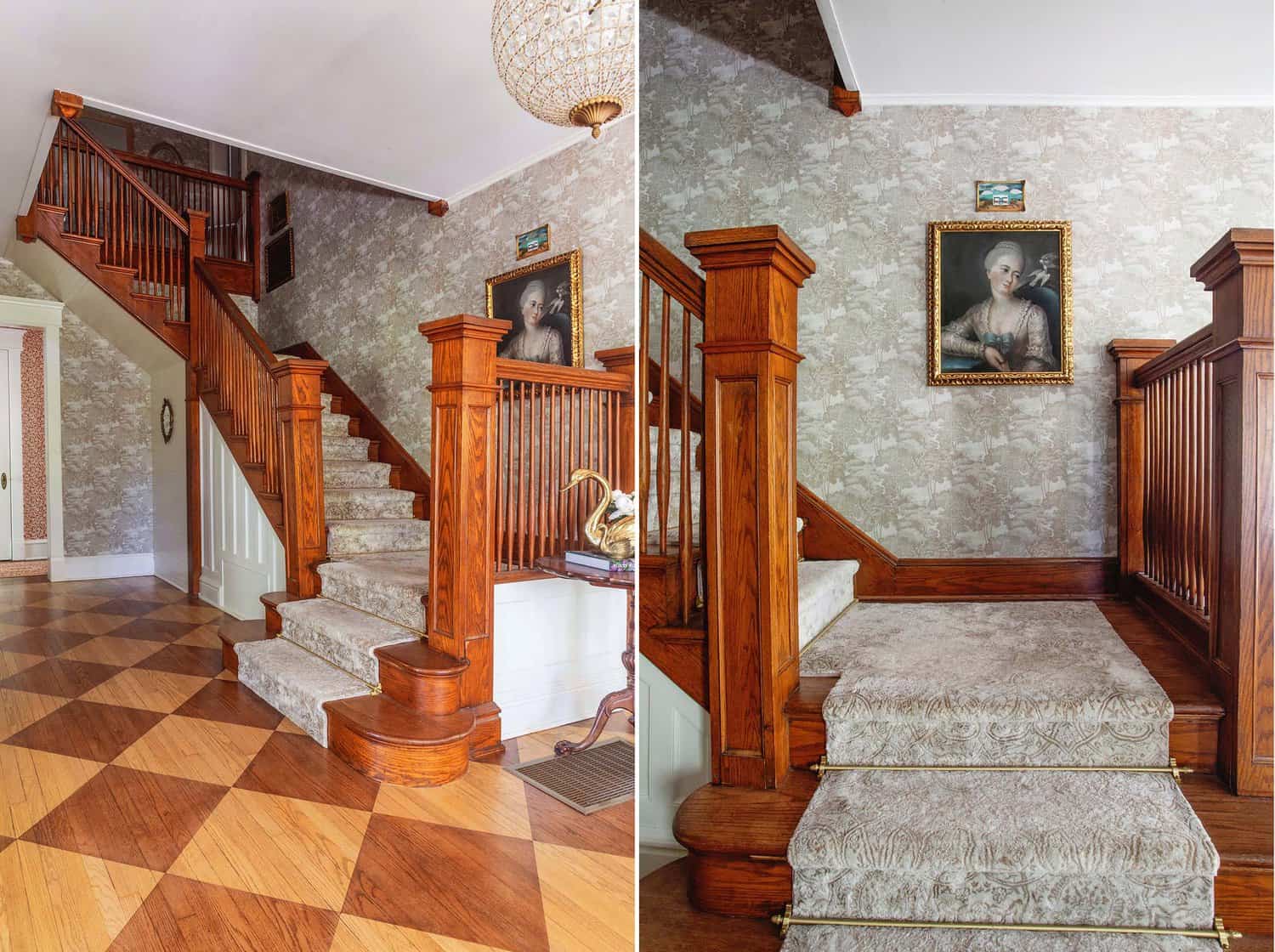
Stairs – I spent a very long time choosing the art for the stairwell. What do you think? The portrait is a pastel and I love her so much. The little ting piece above is by Esther Pearl Watson, one of my favorite folk artists.
For the runner, I went with this light colored runner because it was the best choice at the carpet store we went to. In hindsight, I wish I had gone with antique runners and one day if these need to be replaced I probably will. For now, we are loving the light colored runner.

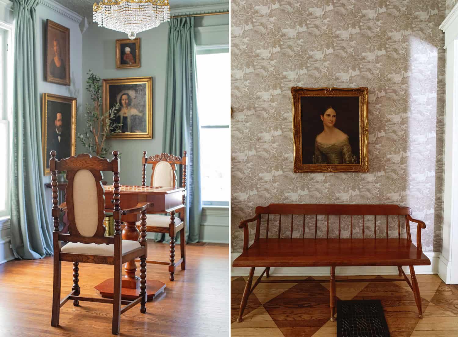
Seating – In the front section of our living room, there was a little extra room so we added a checker and chess game table along with antique chairs. Turns out my children LOVE checkers and all my bad karma from being too competitive as a child is coming back to haunt me.
The bench is super special to me because it came from my grandmother’s home. I have thought about painting it since it’s lighter than the entry table it sits beside, but so far I have left it alone. What would you do?

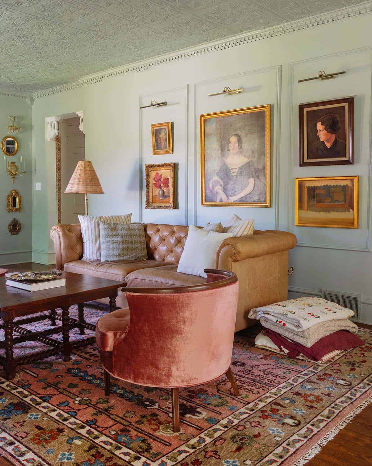
Living Room Decor – I absolutely love our living room. We use it so much and in so many ways beyond simply watching TV. We went with a frame TV this time and I’m always surprised when people really think it’s a painting.
When we first moved in, we did a short round of renovations that primarily included practical fixes and decor. This room got a lot of love. We added a new antique-inspired fireplace, pressed ceiling tiles, dentil moulding and a ton of oil paintings.
Sources: Chesterfield Sofa, Pink Velvet Chairs, Rug (similar), Floor Lamp.

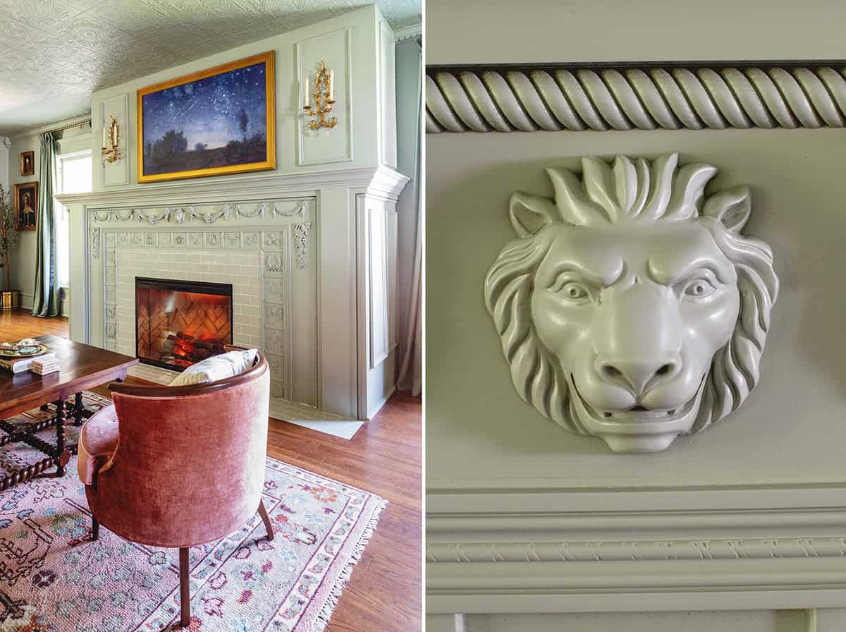
Fireplace Renovation – For the fireplace, I knew I wanted to go with electric fireplaces because I wanted something we could use in all seasons (with and without heat) to add a cozy glow to the room. We went with this fireplace insert (we used it three times in the living room, our bedroom and my husband’s office). Love it!
The paint color we used in our living room is Oyster Bay by Sherwin Williams and the tile color on the fireplace surround is Oyster Shell by Fireclay Tile.
Fireplace Insert We used the Dimplex Revillusion fireplace insert three times in our home. It’s an electric fireplace insert with a cute chevron brick pattern. It has the option to provide heat (or not) so we use it year-round. I am planning to share a full review soon, but we love it! Note- the glass cover is a separate purchase and we purchased ours directly from Dimplex.

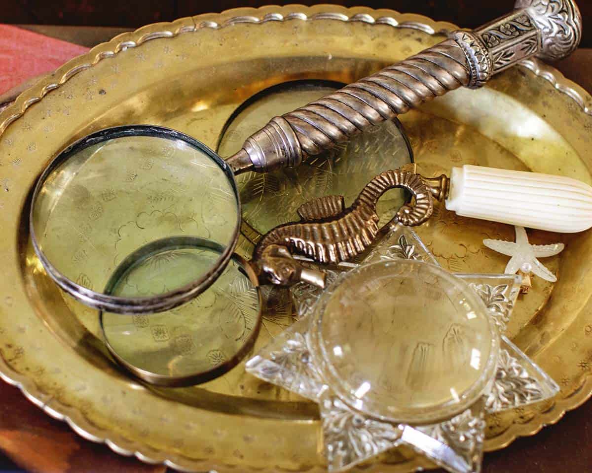
Antique Collections – Since curating a layered look takes a long time, I decided to start with the first floor and work my way up. SO currently our living spaces downstairs are very full of art and antique finds that bring me joy. Over time I plan to add more. This is a plan that can take years, but I enjoy it a lot of prefer not to rush it.

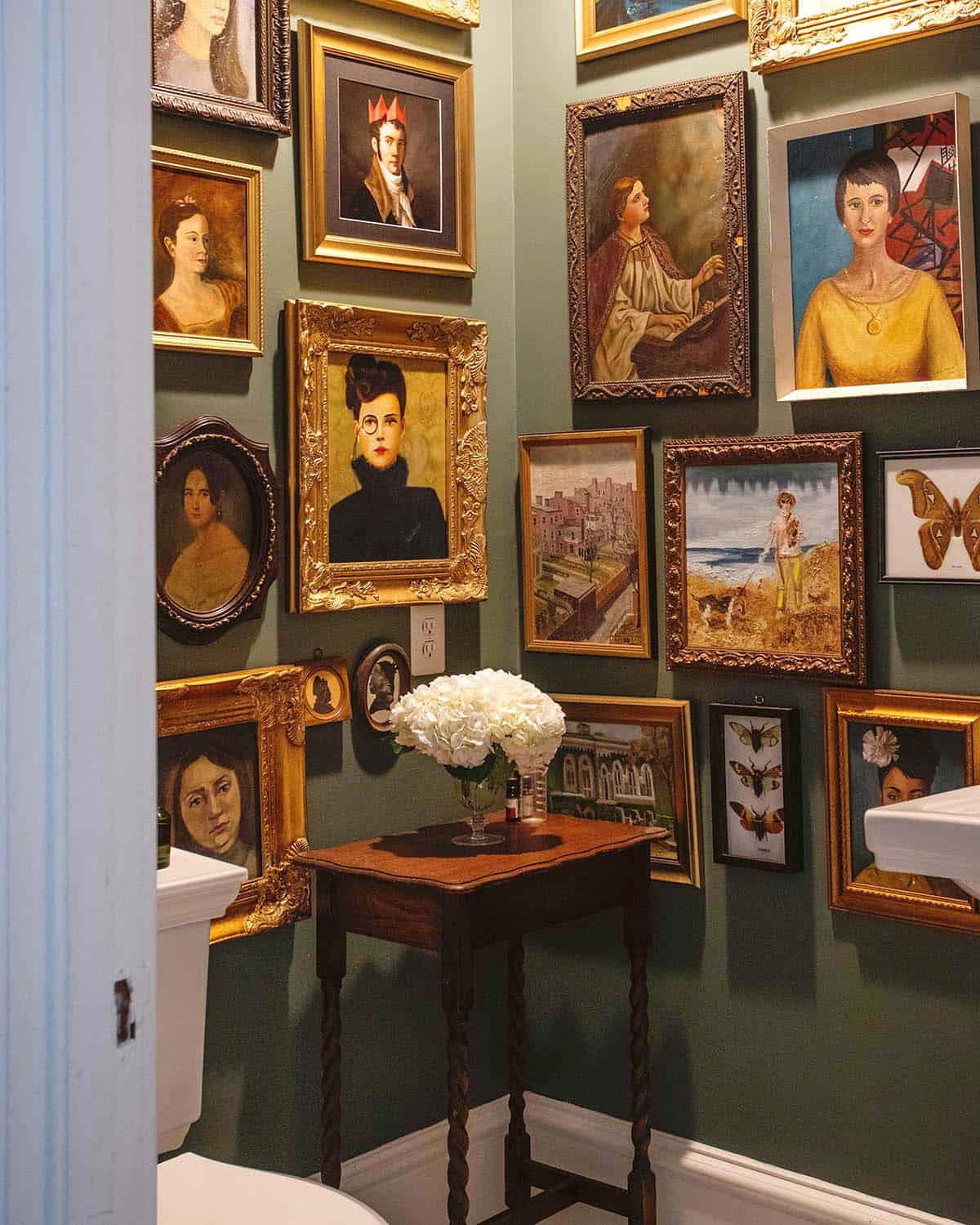
Powder Bathroom – Our powder bathroom on the first floor is the one most often seen by guests so I decided to go all-in—filling it with paintings from floor to ceiling. The woman in the center-right in the yellow blouse is my grandmother Corina and for sure she’s the inspiration for the whole space.

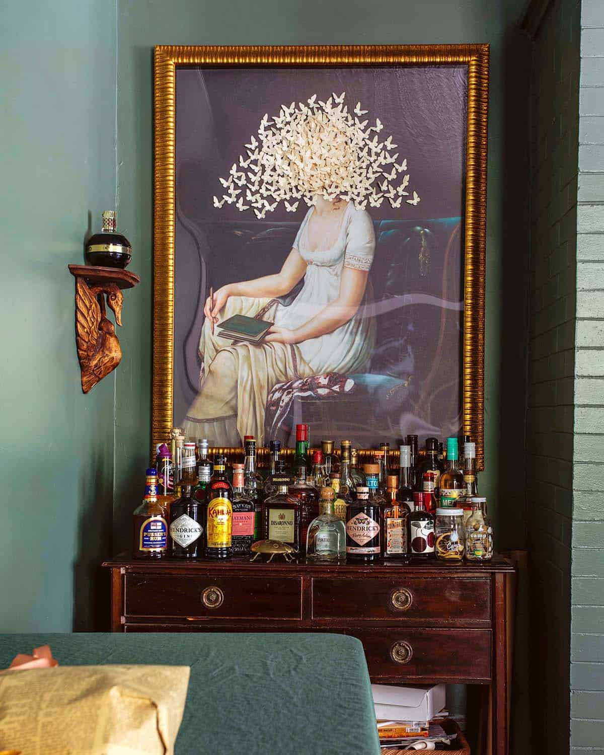
Bar Cart – I currently work as a cocktail writer most weeks (see our cocktail recipes) and in doing so for more than a year I have amassed a huge liquor collection. It’s split between here and the dollhouse bar (below). Learning new cocktail recipes is one of my passions. I found this art piece at Scout Design Studio and the wooden swan shelf is an eBay find.

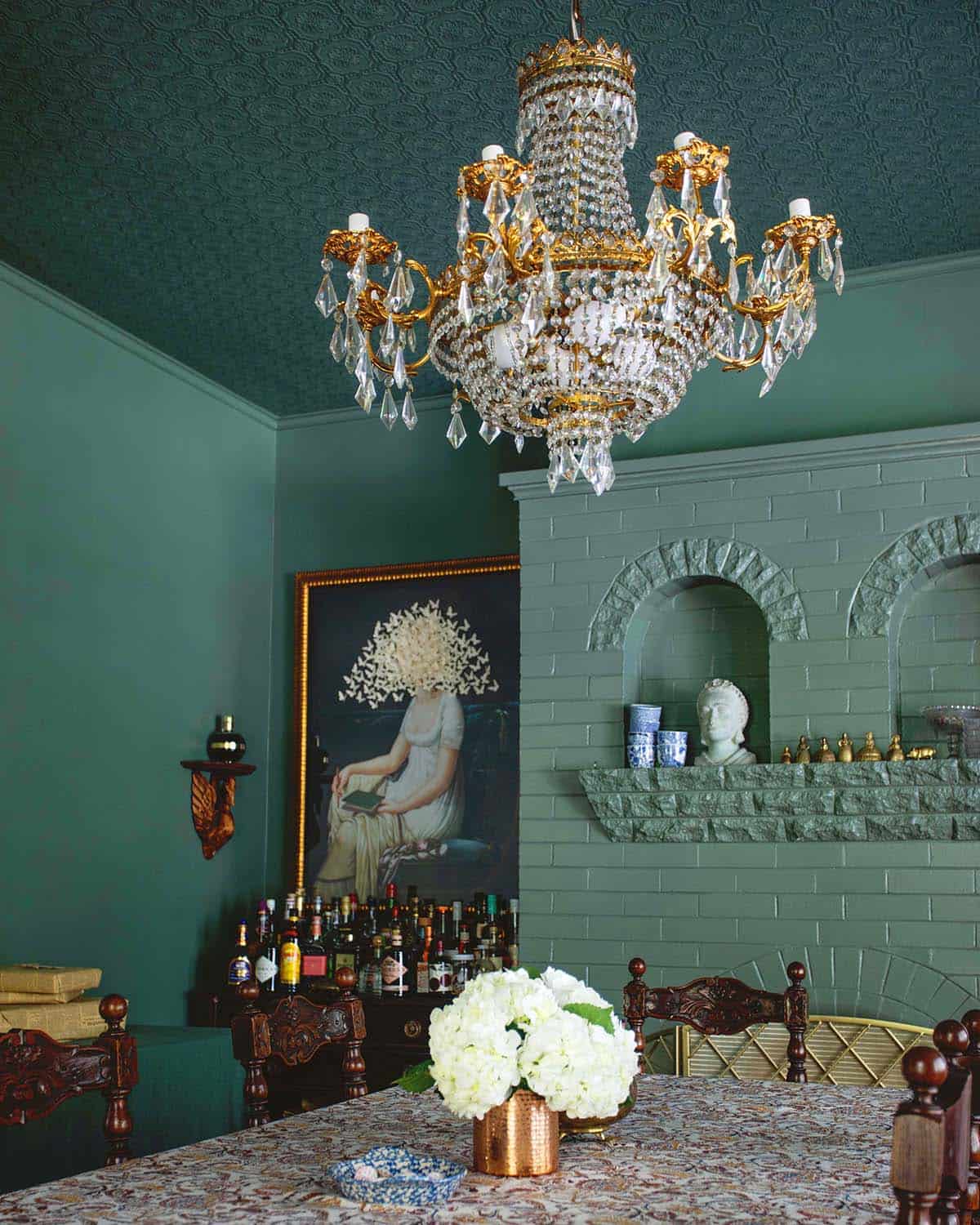
Green Paint – I love the color in this room- it’s Farrow & Ball’s Green Smoke. It’s such a unique, moody green and notice how it looks wildly different from photo to photo.

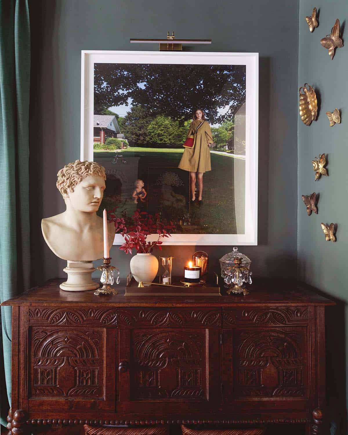
Art Collection – This photo by Julie Blackmon started it all for me, as far as my art collection goes. My sister purchased it for me, as a gift, a couple years ago right before we found this home. Since then, I have been steadily building an art collection.
Fun fact: 75% of the furniture in our home is antique that we sourced locally. The flea markets in this part of the country are incredible. I have always admired antique furniture and having the chance to build our space based on it has been really fulfilling.

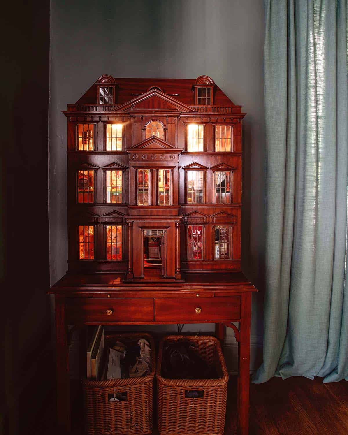
Dollhouse Bar Cabinet – The dollhouse bar has a fun story behind it. One night, I was rewatching my favorite movie “Knives Out,” and I noticed that the giant dollhouse in his living room was actually a bar. I looked them up immediately finding that they run between $6,000 and $20,000 (I know, right??!). The next day, I found one on an estate sale auction and was able to win it for a fraction of the retail price. To me, this is the best evidence I’ve found that we’re living in a simulation designed in our imaginations. Dream big, dream weird, friends! I’m kidding/not kidding.

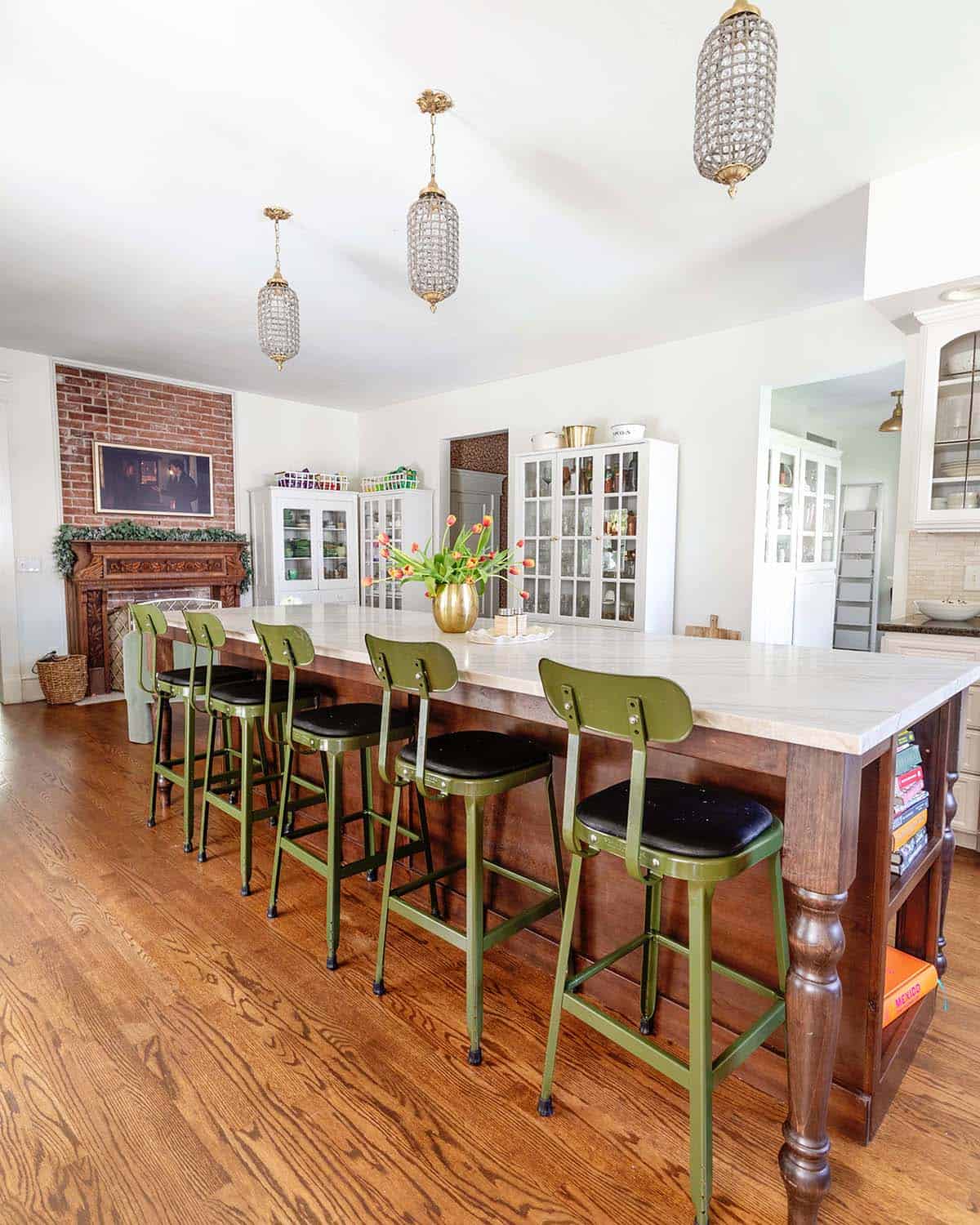
Kitchen Island – Our kitchen is the main room we have not renovated, aside from matching the hardwoods and adding this 10-foot island. I found the green stools from Schoolhouse Electric. I am mulling over design ideas slowly and we plan to complete it in the next few years.
This kitchen was very spare on storage, but had a lot of extra wall space so we added some white storage cabinets. That has been a big help.

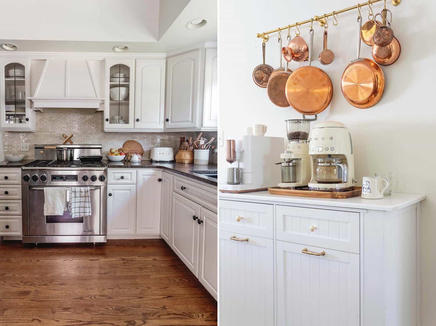
Hidden Trash Can – Here you can see the part of the kitchen we kept as is, and a solution we came up with to make it more functional for phase one. We added this double trash can and built out the counter to make it deep enough to accommodate our coffee gear. Above that, I added a brass pot rail to store our copper pots.

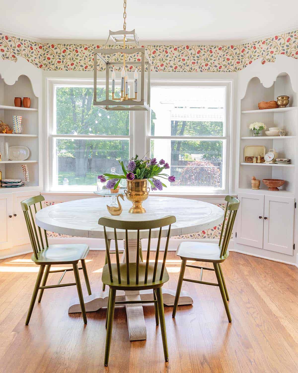
Breakfast Nook – This little breakfast room right off the kitchen was such a fun jewel box to decorate. I do the majority of my food blogging in this space since the lighting is usually best in here. The built in corner cabinets are my favorite original feature.

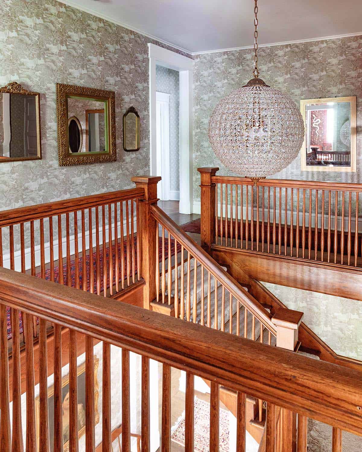
Stairway Landing – Now, we’re moving up to the second floor. This landing at the top of the stairway goes all the way around to access our bedrooms, the laundry room and my office. I decorated it with vintage mirrors all the way around.

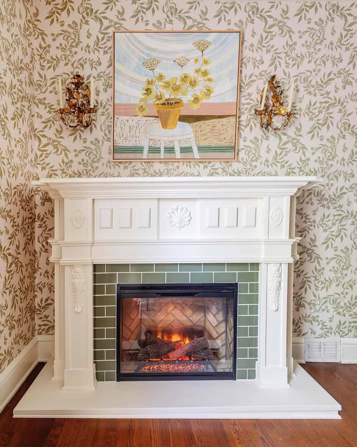
Bedroom Fireplace – In our bedroom, we added a fireplace. For the design, I pulled inspiration from my favorite horror movie, Rosemary’s Baby. We built this fireplace as a replica to the one in her apartment from the movie. When building new pieces, I find it really helps to reference a historic photo and stay as close to it as possible.
The wallpaper and painting in this room are from artist Lulie Wallace. I’ve been a fan of hers for more than a decade and have loved every evolution of her work. The painting makes me smile every day.
The biggest departure we took from the movie design is instead of a black marble surround I chose a tile that coordinated with our wallpaper. We used Fireclay Tile in the color Peabody.

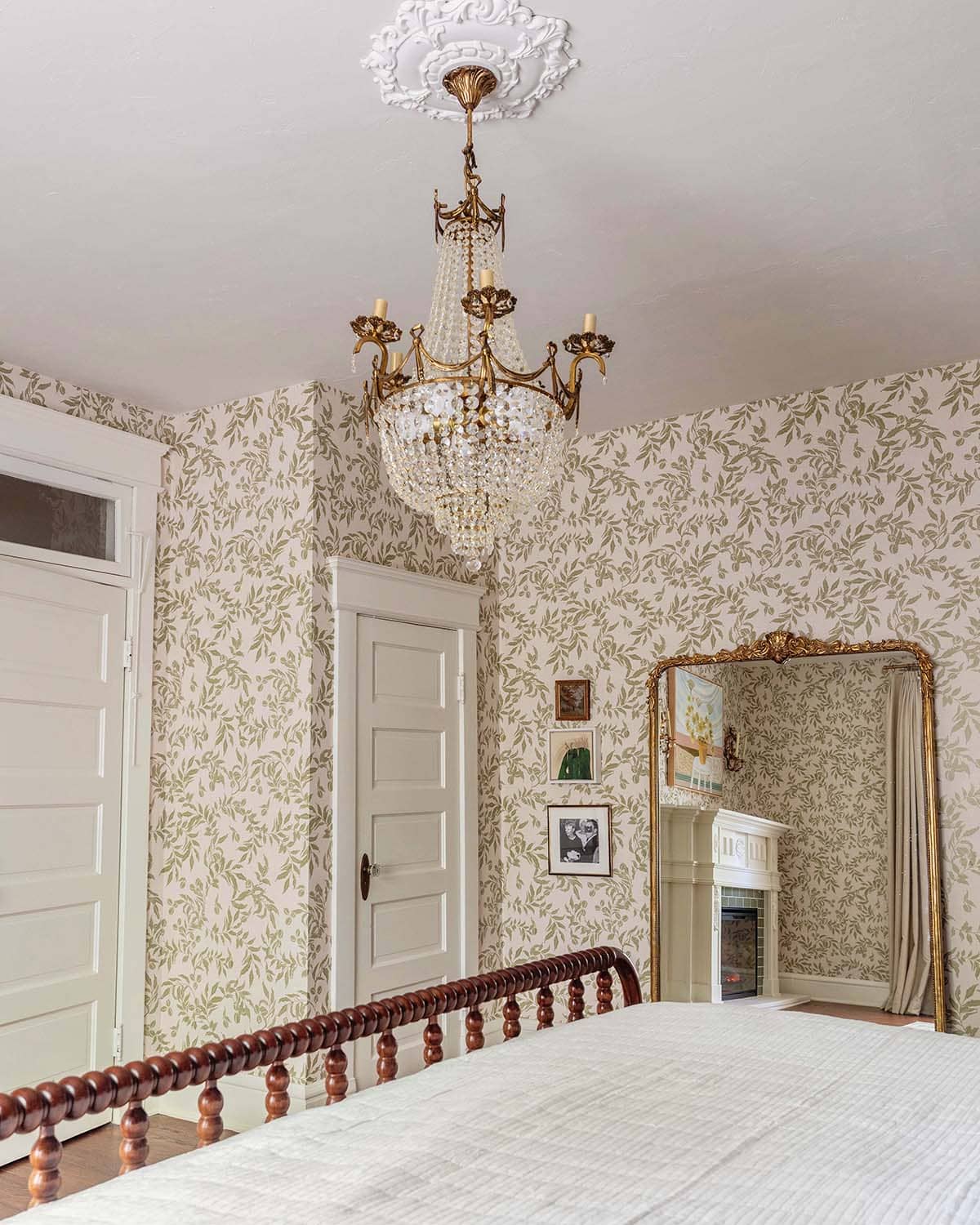
Antique Lighting – Lighting was a huge project for me this year. The home only came with a few chandeliers that were antiques from the early 1900s when it was built, but we added dozens more. I will be honest, it’s almost always more steps and sometimes antiques even need a full rewiring. To me, it is worth it and a major way we added charm back into the home.

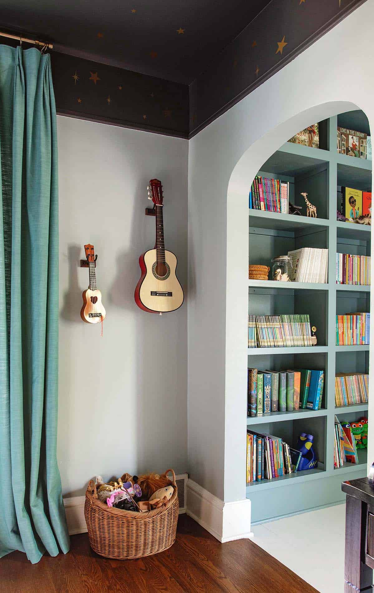
Kids Bedrooms – Our girls are old enough to choose their own bedroom themes now. Nova chose a space and science theme. Marigold chose a princess bedroom.
This photo shows my favorite peek through of the house with a floor to ceiling kids library for our 8-year-old daughter.

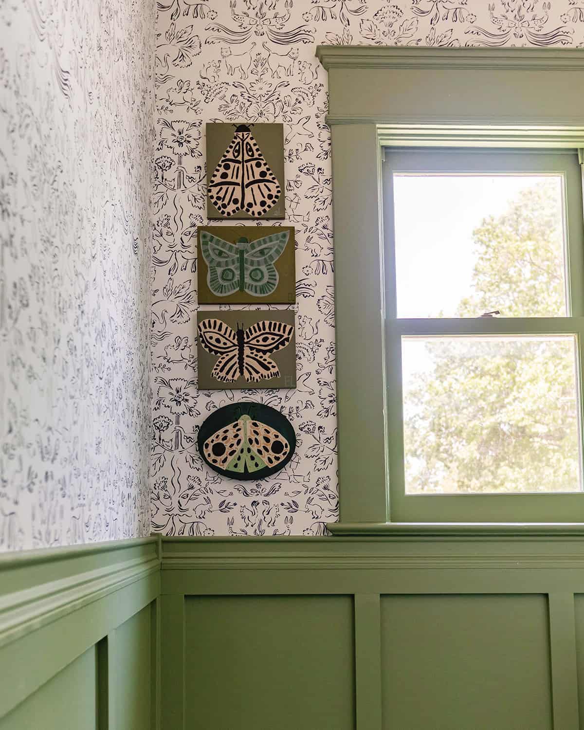
Kids Bathroom – This is a children’s bathroom. We are still in the process of decorating it. The wallpaper is Hygge & West Storyline in the color Delft Blue. The paint color is Farrow & Ball’s Breakfast Room Green.

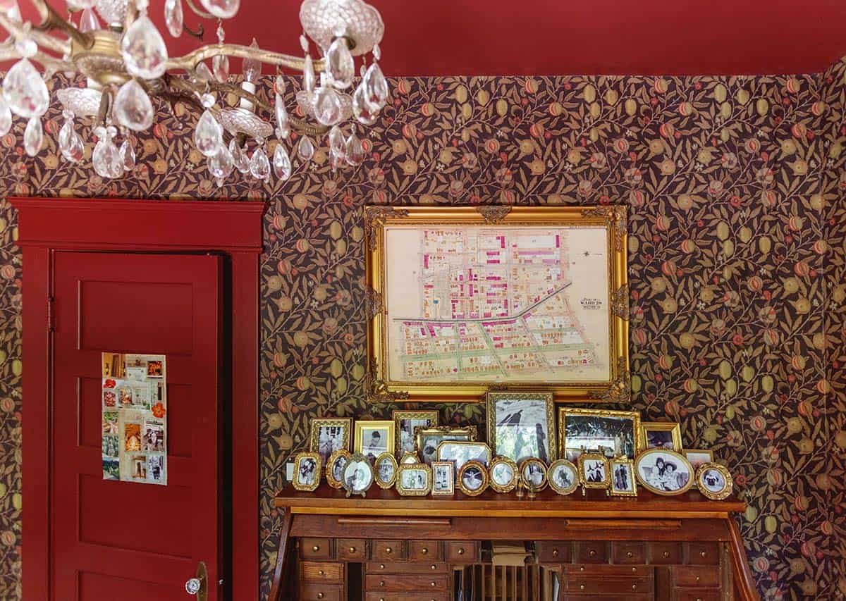
Moody Office – My office is the most moody space in our home and since it’s a very small room, the wallpaper and intense red paint color made a huge impact. I found this rolltop desk from Marketplace.
The display of small gold frames is the first spot in our home where I decorated with family photos. I hope to add a few more moments like this.

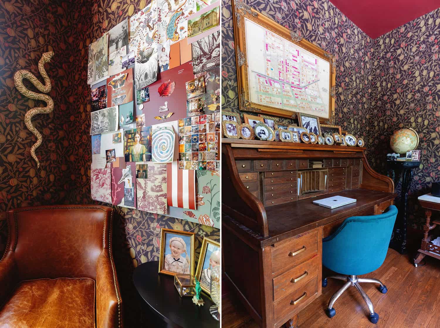
My snake is by Paige Dorsey Barnes. I commissioned her through Liz Lidgett gallery. Someone remarked that it looks like “Adam and Eve” theme, which was not what I was going for, but I love it.

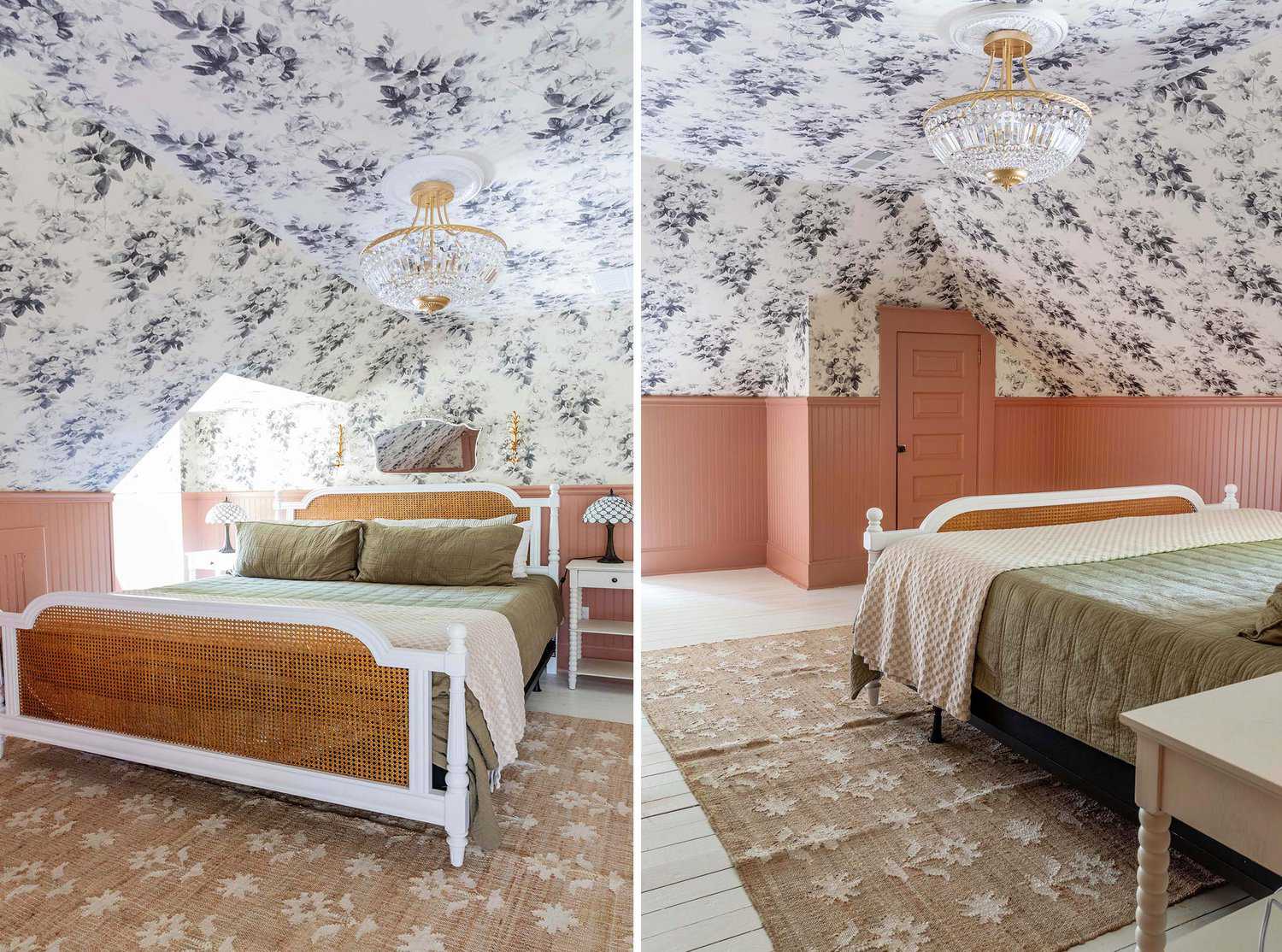
Guest Bedroom – We are moving up to the third floor now. This floor consists of two guest bedrooms (we have a lot of family and friends with young kids), a full bathroom, a lot of bookshelves and a bit of living space.
The guest room has a lot of angles so I knew I wanted to use a busy wallpaper. I chose the London Rose Wallpaper which is an OG. The paint color is Foxy Brown by Benjamin Moore. We used this jute rug with flowers.

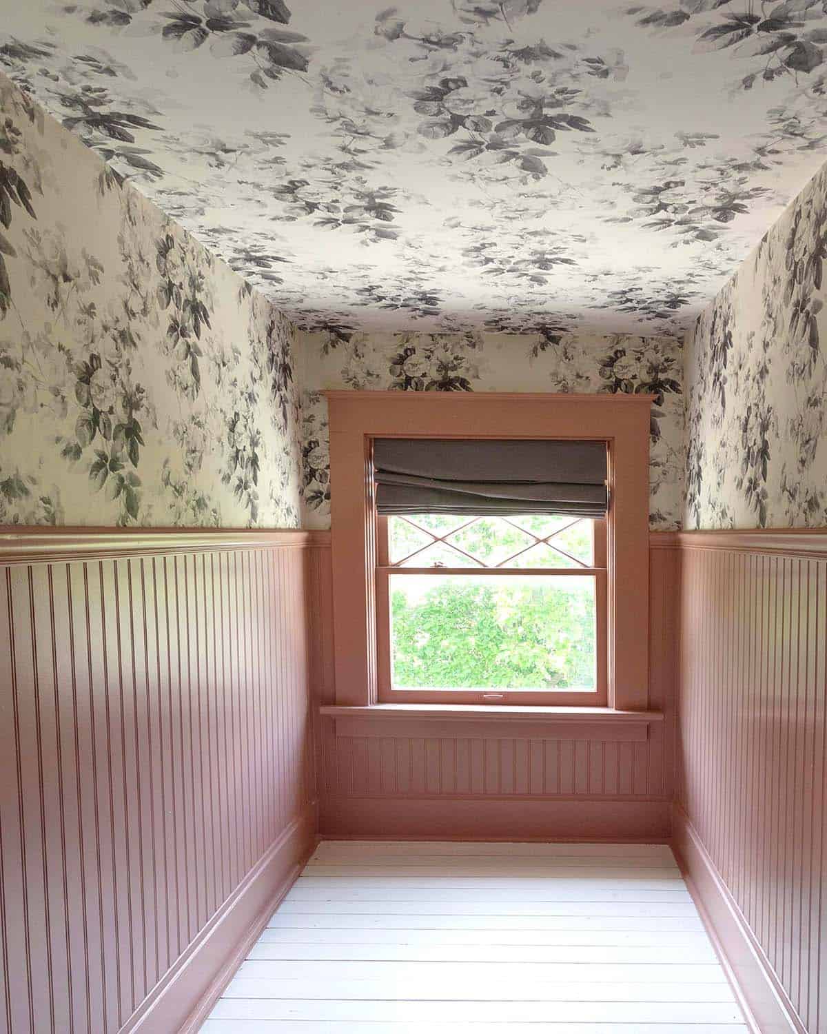
My favorite wallpaper and color combination in the whole house!

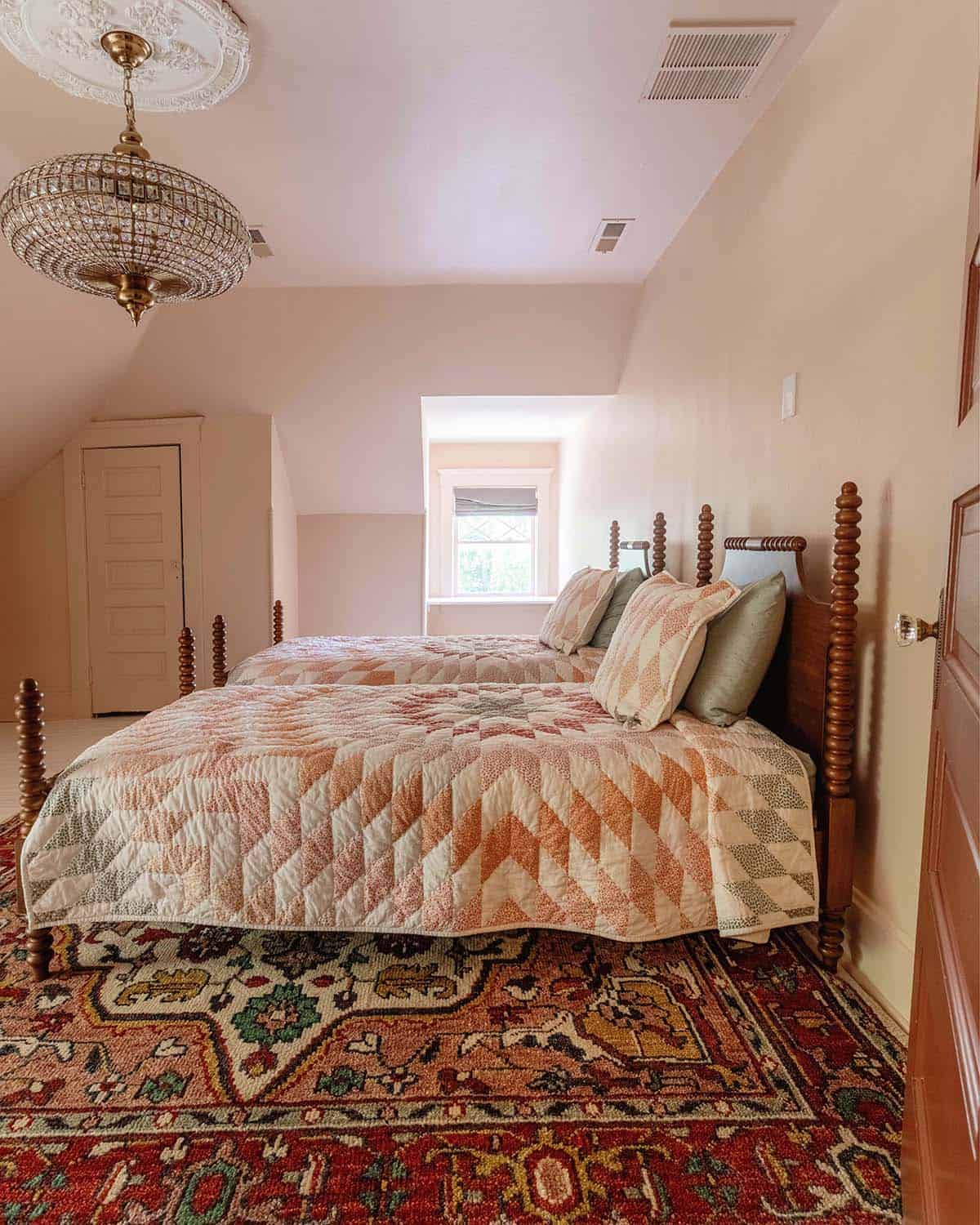
The kids guest room is set up, but not very decorated yet. We chose Setting Plaster by Farrow & Ball, which is a soft beige pink. The twin beds look antique, but they are from Chris Loves Julia’s PB for kids line.
Sources: Beds, Rug, Quilt, Chandelier.

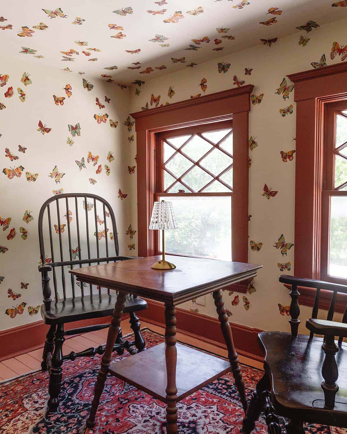
Saved the best for last. I am thrilled with how this sweet little nook turned out. It’s surrounded by our home library and the perfect little tea party spot.
Butterfly Nook – We used the Hygge & West Butterflies wallpaper in the color parchment for this small nook. I am strongly on team when it doubt, wallpaper the ceiling too. I love the cozy, vintage feel it adds to this space.
More Home Posts:
Let me know if you have any questions or need any extra links in the comments! xx- Elsie

