There are times I think about ALL of the doofus decorating mistakes I made when I first started attempting to beautify our house a decade ago, and part of me wishes someone had warned me!
Like yes, the colors on the little paint chips in the paint store DO look totally different than they will painted onto the walls in your dark bedroom.
No, do not decorate around the piece of furniture you know you really hate.
Girl, listen, stop trying to make a postage stamp sized rug work in a giant living room. It’s not gonna happen.
But apparently, sometimes you have to learn things the hard way. Or at least, I did!
This is a post I’ve been meaning to share for so long, and since some of them came up in the Bless’er House Budget Decorating Community recently (which you can sign up to join here), I thought now was a great time to spill ’em all. Friend to friend.
1. Not Testing Paint Colors Before Buying
We made this mistake in our last house all because I chose a paint color from a fan deck while sitting on my parents’ living room sofa at night by lamplight (just so you know, picking paint colors in bad lighting that isn’t even in your own house is a bad idea).
After Robert and my father-in-law painted our entire downstairs in that dark, yellowy beigey shade, I knew I’d made a huge mistake. But there was no turning back.
- Pick out a few favorite paint colors from paper swatches (use Pinterest or Instagram to get ideas on a few to sample, if that helps.)
- Get some sample pots of those colors and paint them on a piece of white foam board. Tape them to your walls, and take a day or two to look at those paint colors throughout the day in all kinds of light (and lamp light) to make your final decision.
Related: How to Choose Paint Colors for Your Home Interior Like a Pro

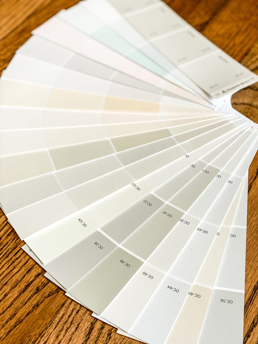
You’ll thank yourself later for going through the sample process to decide the best paint color. If you need a leg up, here are some of my favorite go-to paint colors.


2. Decorating With Too Many Small Accessories
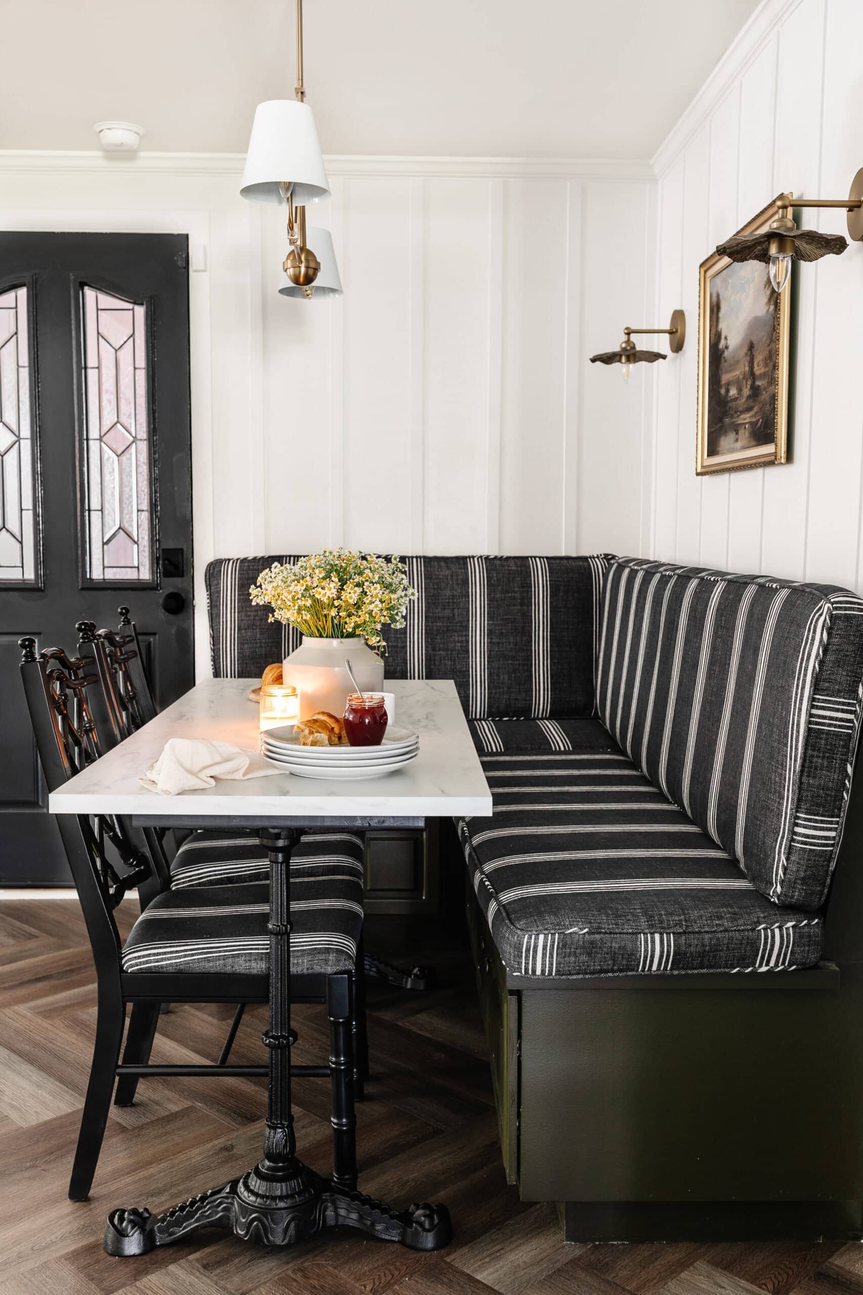
I used to cram 20 different little decor accents on a dresser or end table or shelf because I liked all of them individually.
And I figured, well, hey it will all look cute together. But it ended up being a cluttery looking mess.
When decorating tabletops, dressers, chests, and other flat surfaces, remember less is more. Vary heights and sizes of accents you use on tabletops. And follow these styling tips for coffee tables, entry tables, nightstands, buffets, and end tables that might help.

3. Not Having Plants (Whether Real or Fake)
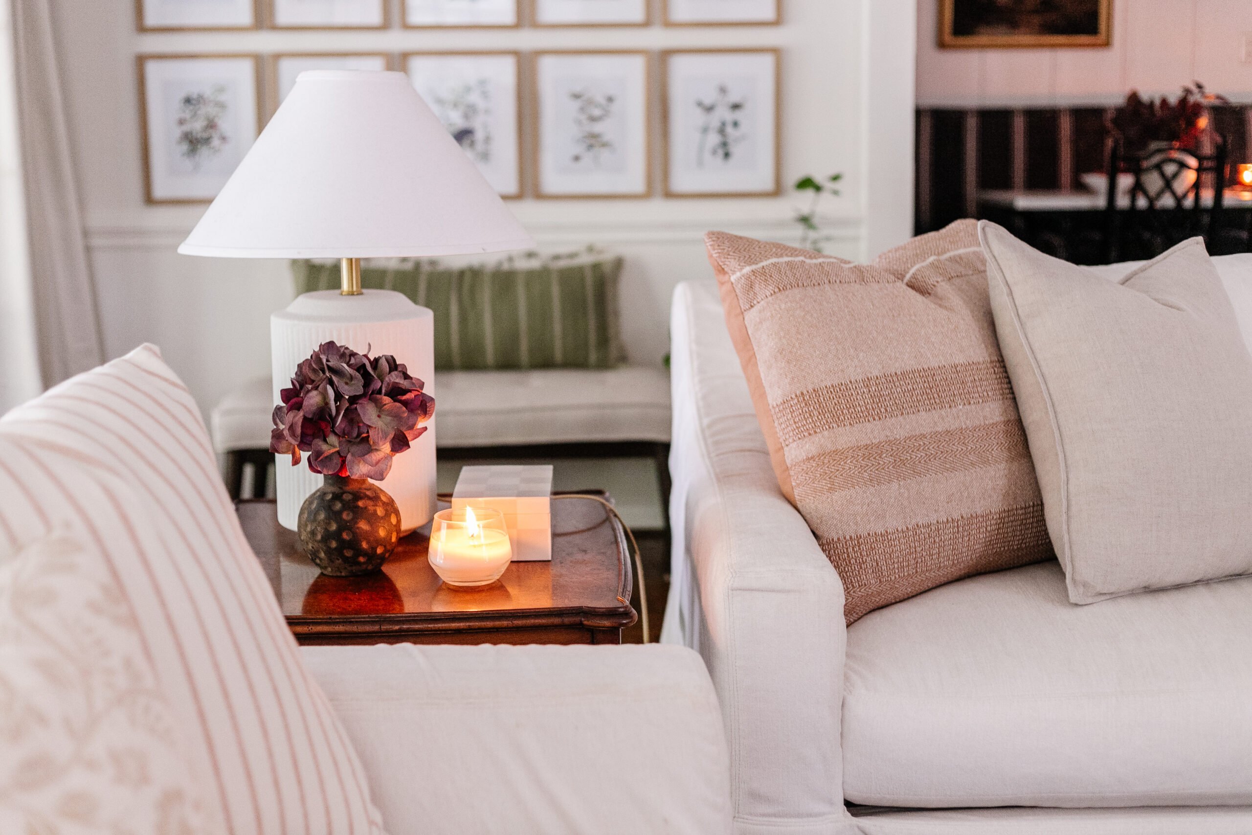
Before I figured this one out, I’d look at a room and think, “Something is… missing.” And I could never put my finger on it until that “ah ha” moment. Oh yeah! Life… living things.
See that hallway below? Put your fingers over those 2 houseplants and what does it look like? Blah. That’s what.
Even if you have a black thumb and have to use the artificial kind instead, plants brighten a room and make the space feel alive.
Related: Best Artificial Indoor Trees and Tips to Make Them Look Real | Where to Find the Best Fake Flowers That Look Real

4. Having Too Many Picture Frames on Tabletops
Any time I see “decorating tips” articles telling me to hang art and stay away from displaying family photos, I think, “You have lost your dang mind. People live here, not robots.”
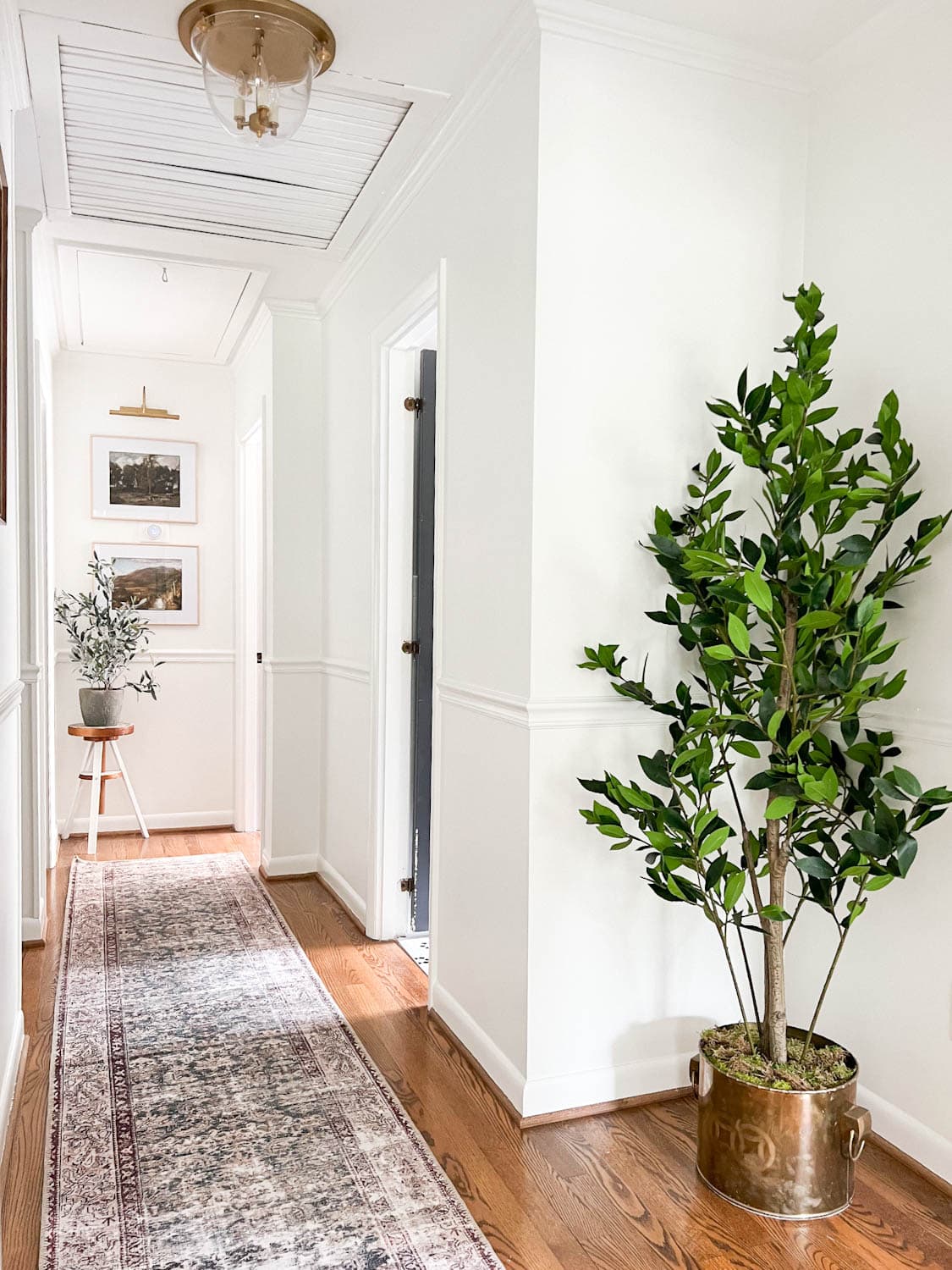
But back when I filled up entire console tables with picture frames of family, I realized it was crazy overwhelming, sort of like the knick-knacky problem in decorating mistake #2.
Instead, display family photos in a gallery wall, or just select 1 or 2 small picture frames for a tabletop.
If you’re extra particular about wanting it to look clean, simple, and modern, opt for simple black and white prints in black frames. Instant streamlined decor but still sentimental (and timeless).

5. Having Exposed Cables and Cords
When we first put up our TV in our old house, it was a tangled mess, but I didn’t really know how to resolve it, so we just lived with it for a while.
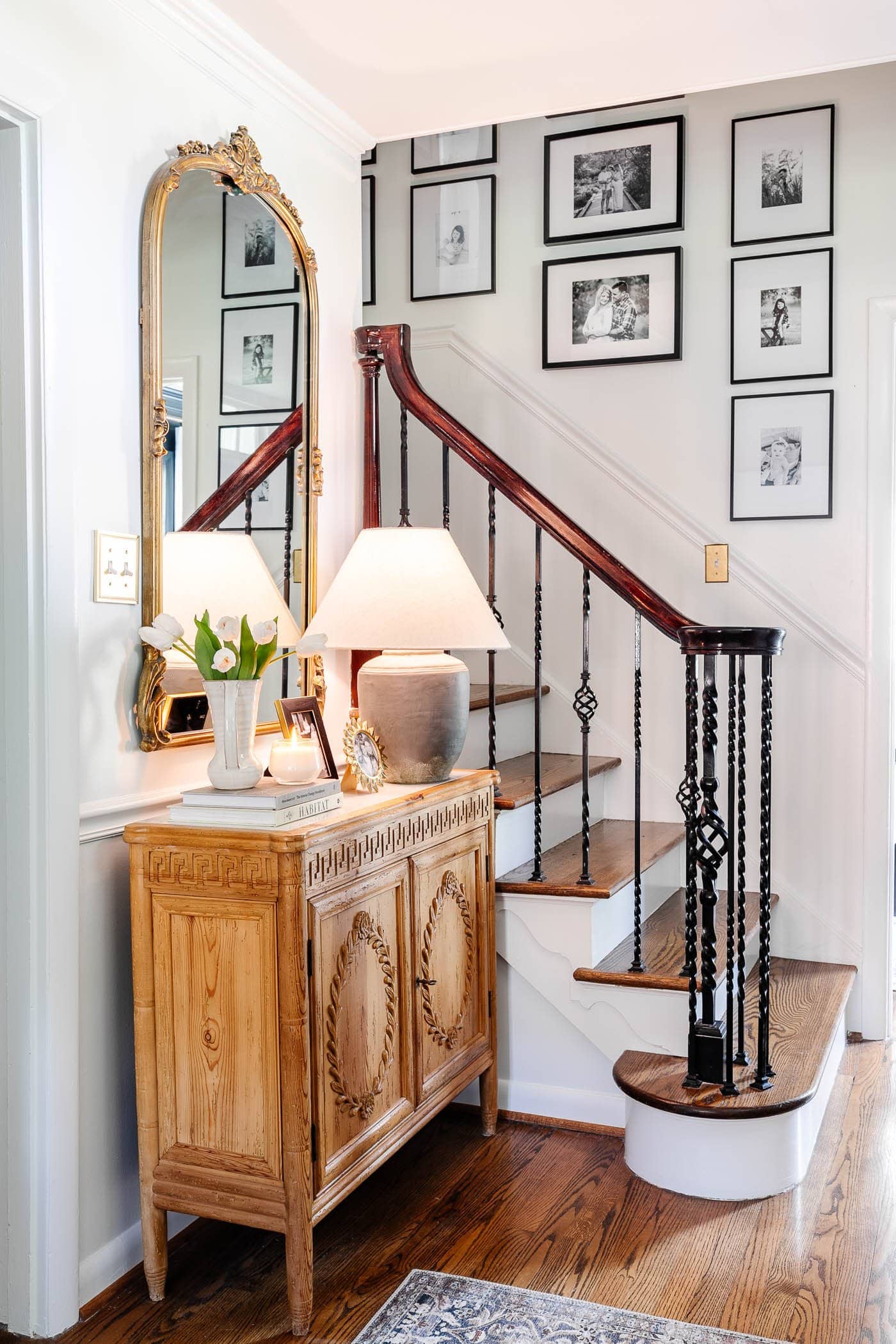
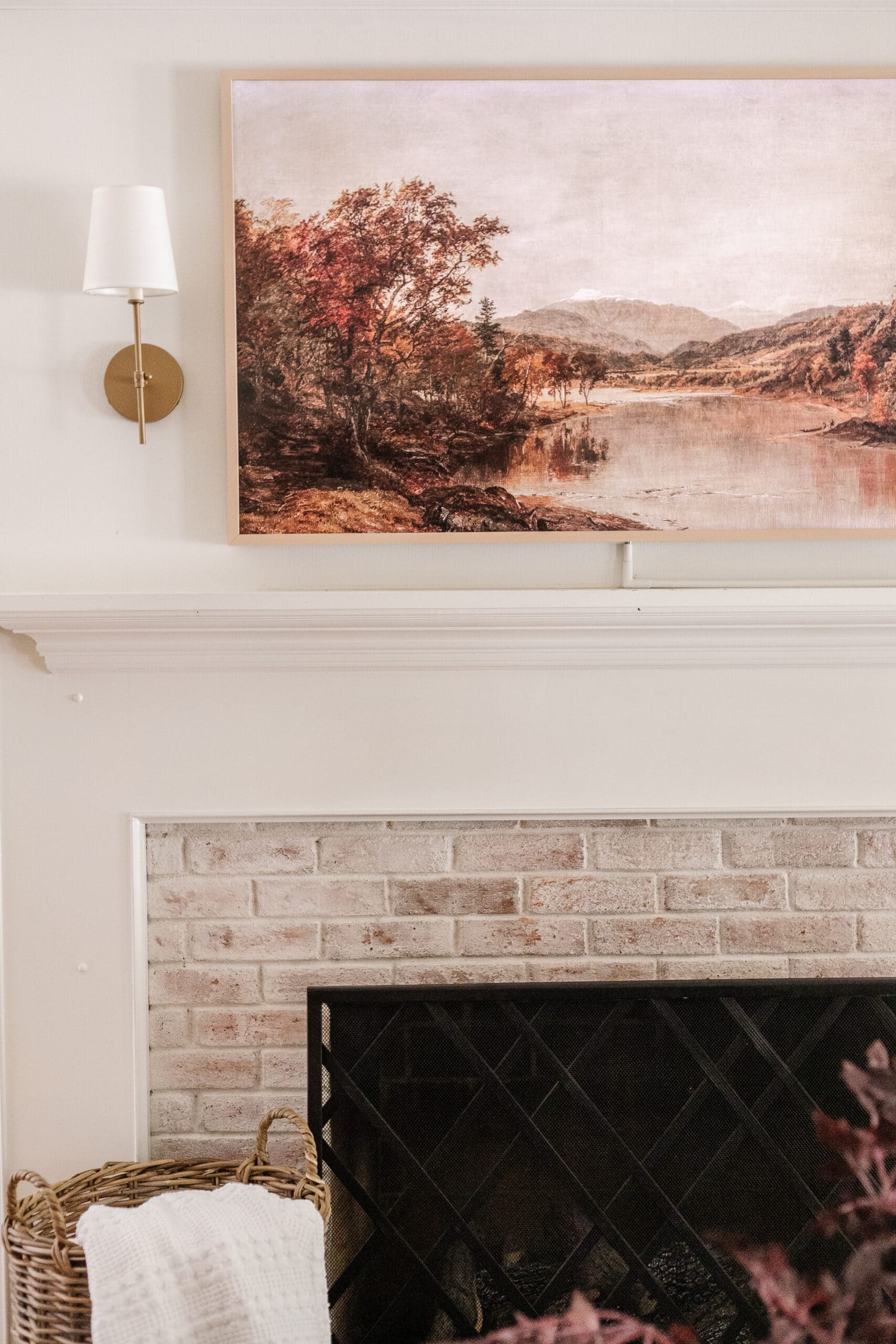
For a simple solution, pick up some cord covers, wrap them around your cords, stick them to the wall, paint them the same color as your wall, and ta da! Cords are disguised.
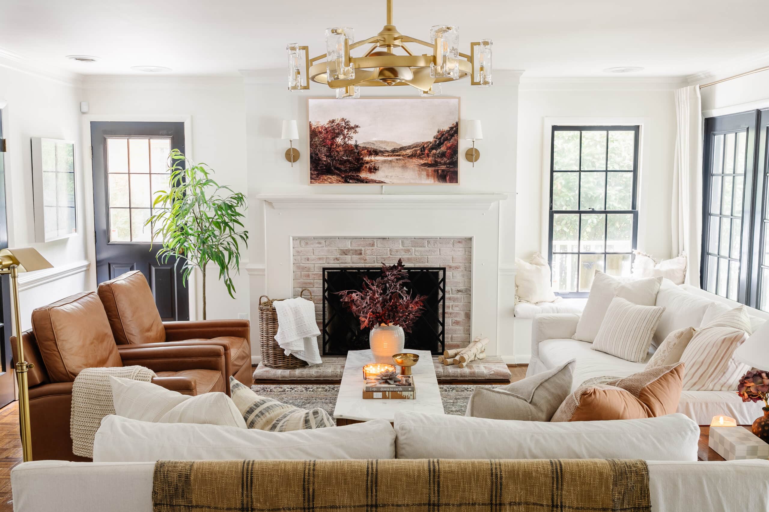
Do you see our cords running underneath our TV? Cord covers, baby! They’re just barely noticeable.
Here’s how we created storage for our electronic boxes in this DIY window seat.
Related: 15 Aesthetically Pleasing Ideas to Hide Ugly Household Items


6. Decorating Around Something You Hate
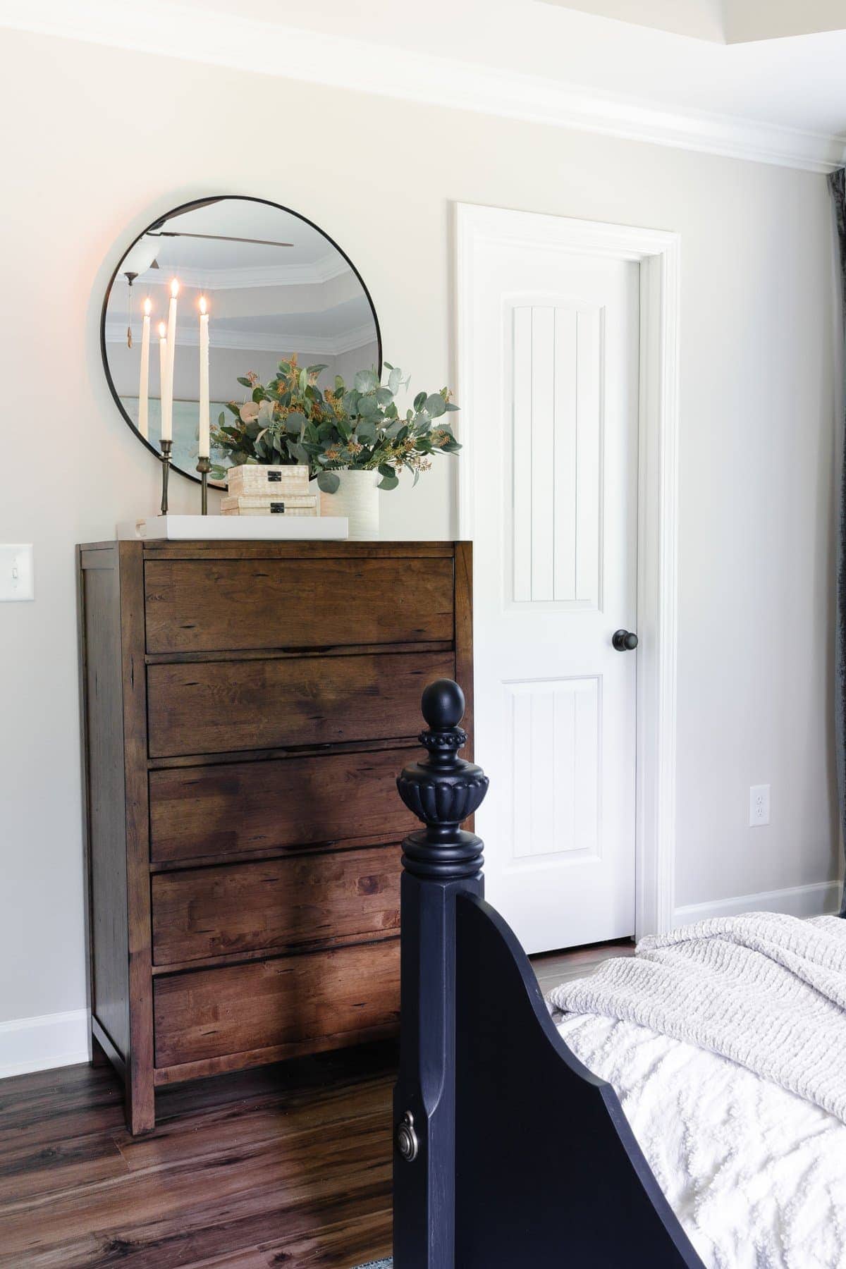
If I had a dollar for every time I tried to decorate around a piece of furniture I hated instead of just selling it and using the money to buy something I actually liked, I’d have quite a few bucks.
Decorating around something you hate to make it work = an entire room you’ll hate along with it.
You don’t have to have the money to buy a new replacement piece of furniture to swap out the piece you don’t like. Thrift stores, Facebook buy/sell/trade groups, consignment shops, yard sales, and Craigslist are packed full of potential.

7. Not Decluttering Before Redecorating
You know those “Love It or List It” shows on HGTV? Half the time, when the homeowners are walking around talking about how much they dislike their house and how “dysfunctional” it is, most of their problems would be solved just by decluttering.
Before you can fully wrap your brain around how to decorate a space, remove everything. EVERYTHING! Sort, donate, and come up with a way to organize what you do keep, and then the pretty decor can follow. (Here is a decluttering checklist that can help.)
Related: How to Declutter Your Home Quickly with These Organizer Secrets


8. Having Too Much Furniture
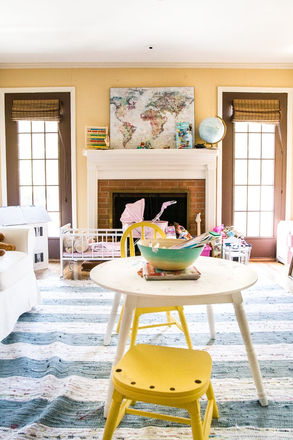
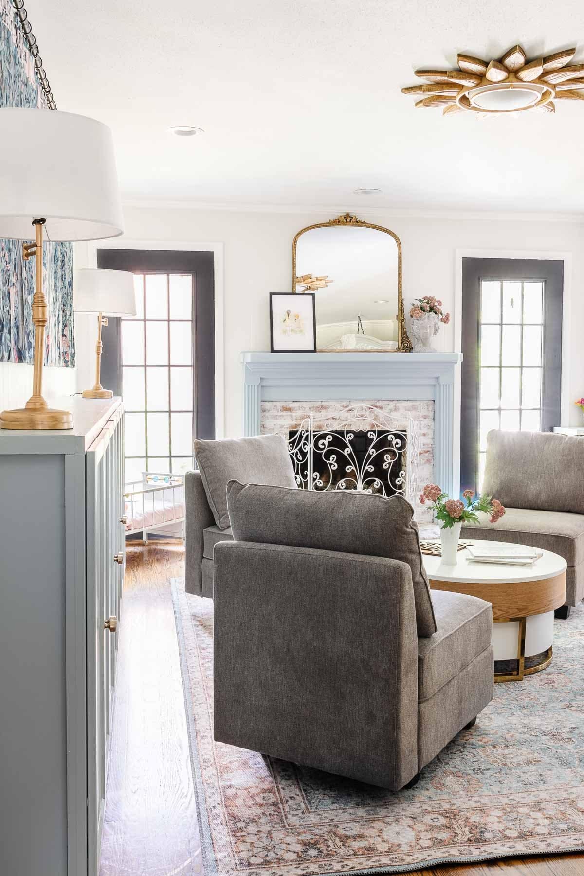
If there is no space for foot traffic to flow in a room, start editing and making a plan to keep only the furniture you need. Or swap out furniture pieces that are just too large for the space to replace with smaller furnishings.
Rooms crammed with furniture feel smaller, and they make the room less functional. Figure out what pieces you use the most and try to scale back on the rest.

9. Using Rugs That Are Too Small
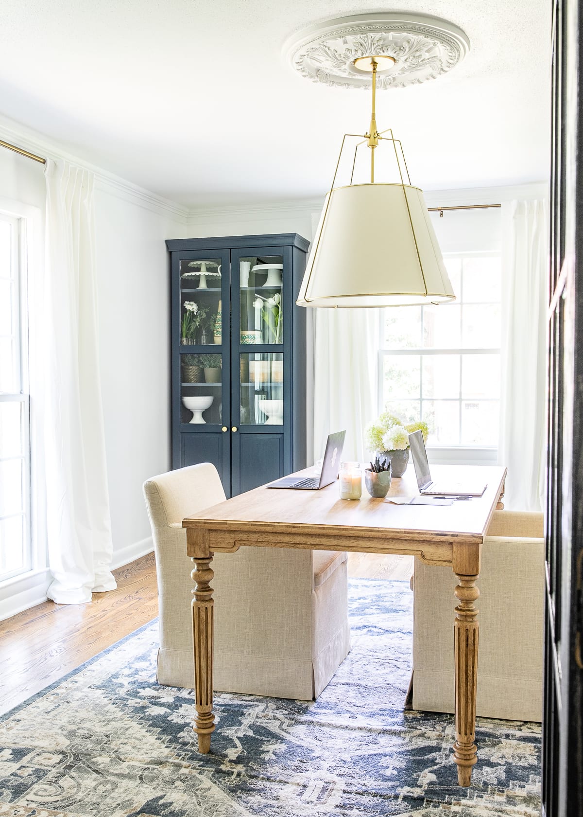
One time, I stuck a 4×6 rug underneath our dining room table because hey… it fit. But the dining chairs were hanging off the edge, it got in the way, and the rug looked awkward. If it just creates an obstacle every day, why have it?
Use this rug selecting guide to choose the right rug size for your room.
Generally, I use a minimum of 8×10 rugs under beds and in living rooms (9×12 for larger spaces) and at least a 6×9 under a dining table (as long as all four chair legs fit on it too with a foot of space behind for sliding the chairs out).
Related: 25 Best Places to Buy Rugs Affordably Online

10. Mixing Too Many Disjointed Patterns
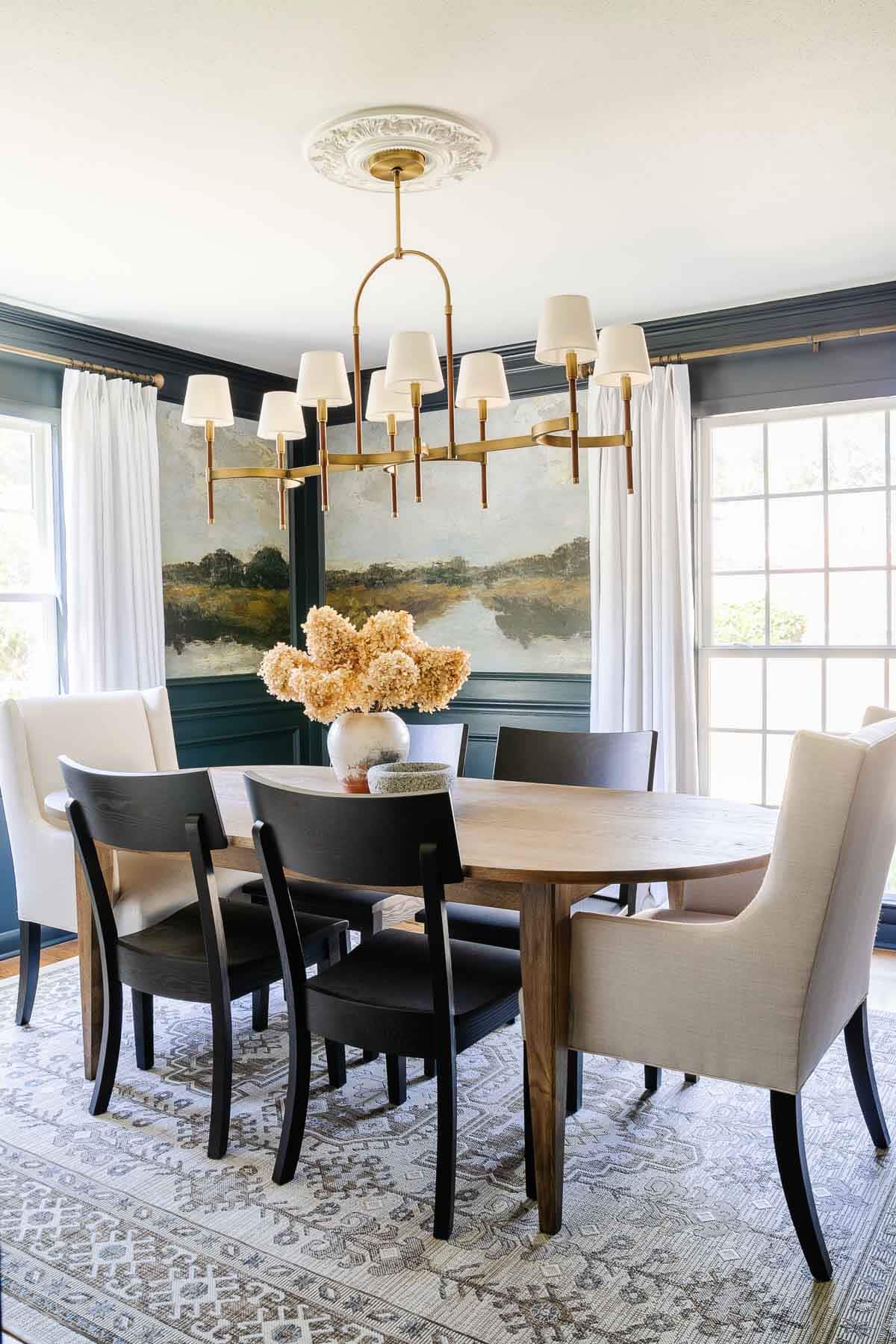
I think I used to have a phobia of solid fabrics. Because at one point, every single rug, curtain, and pillow had some sort of print or pattern on it. And it was the busiest mess ever.
Stick to about three fabric patterns at a time. I like to use a vintage style rug because the print is fluid and very forgiving. Combine it with a nature-inspired print (like a floral), a geometric print (like a stripe or plaid), and a solid fabric or two that still have some sort of interesting texture.
Related: How to Mix and Match Throw Pillows

11. Hanging Picture Frames Too High
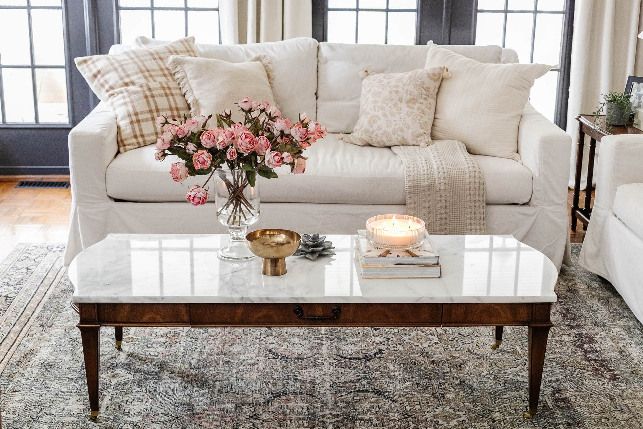
I used to hang photos way up high and level with door frames until I started flipping through magazines and realized I was doing it totally wrong.
Hang wall decor and art at eye-level, around 57″-60″ from the center of the art to the floor. (Not like Shaquille O’Neal eye-level.)
Related: Mistakes Most People Make When Hanging Picture Frames

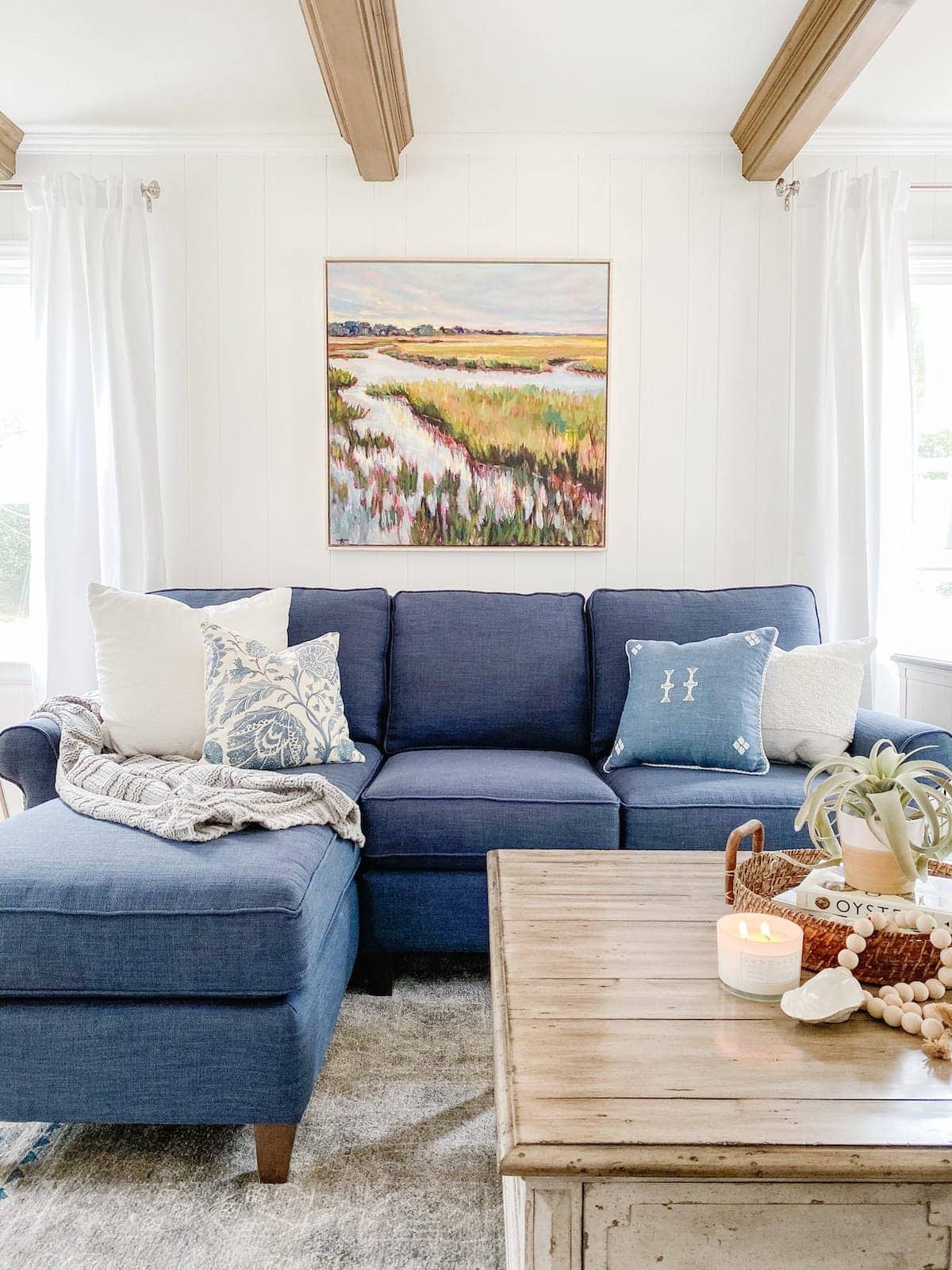
12. Not Using Any Color or Contrast
When I first started decorating our last house, the basic premise was beige on brown on gray on greige, and it was a total snooze-fest. (Adding in tip #3 by incorporating a couple of plants helped at first though, until I figured that out.)
I still love neutrals. Our current living room is totally white at the moment. BUT the fun part about neutral walls is you can have fun with color in the accents, if you’re scared to go too permanent.
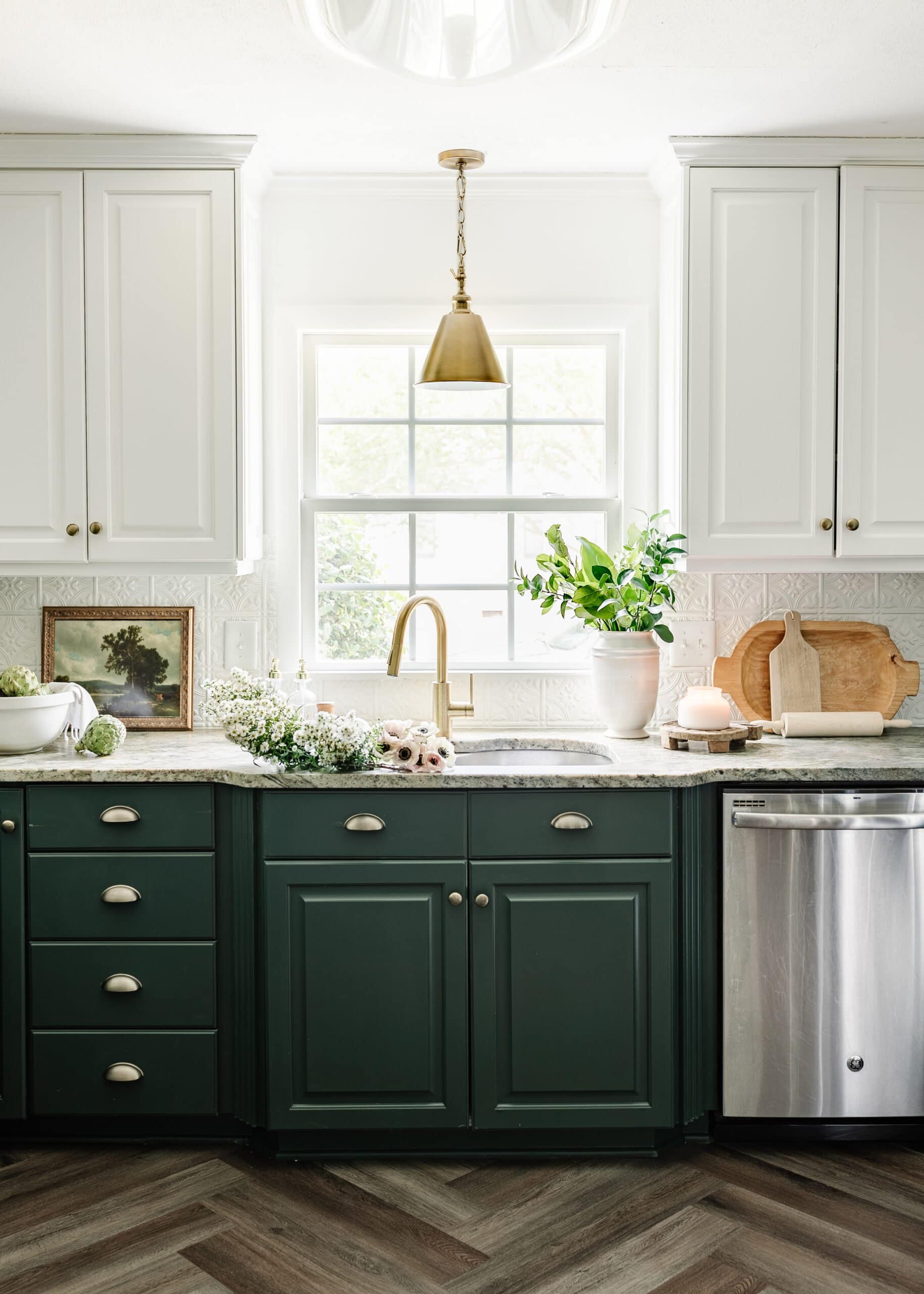
I love incorporating blue and green for my color-timid self because both are widely found in nature and they don’t feel quite as shocking to the eye, if you’re shy about going too bold. Here are some great dark blue, light blue, dark green, and light green paint colors to try. I love this calming paint color palette too.

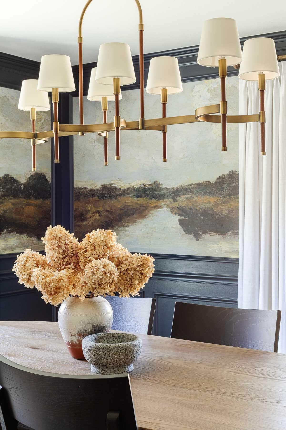
13. Hanging a Chandelier Too High
The general rule for hanging a chandelier over a dining table is 30″-34″ when you have 8′ ceilings. For a ceiling higher than 8′, hang the chandelier an additional 3″ higher for each foot of ceiling.
Related: Shaded Chandeliers for All Budgets: Splurge vs Save

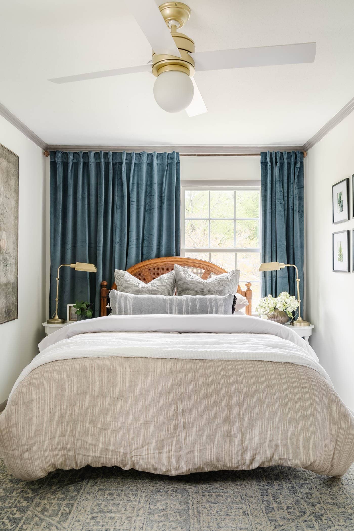
14. Hanging Curtains Too Low or Too Short
Hanging curtains “high and wide” is the best trick to make rooms appear bigger. Mount your curtain rod close to the ceiling (just below the crown molding 3″-4″ from the ceiling), particularly in a room with low ceilings. Use the same measurement for arched windows.
To make windows appear wider, extend the curtain rod approximately 10″ outside of the window frame.
Curtain panels should just barely touch, “kiss”, or slightly “puddle” to the floor.
Related: Best Luxury for Less Amazon Curtains & Window Shades

15. Relying Completely on Overhead Lighting
Layer the lighting in your rooms by having an overhead light, table lamps spaced evenly apart, and incorporate task lighting (like desk lamps) or wall lighting (like sconces in hallways or dining rooms) when possible.
The end result is a balanced, evenly lit room that creates a feeling of warmth. (I prefer 3000K light bulbs because they’re not too yellow and not too blue.)

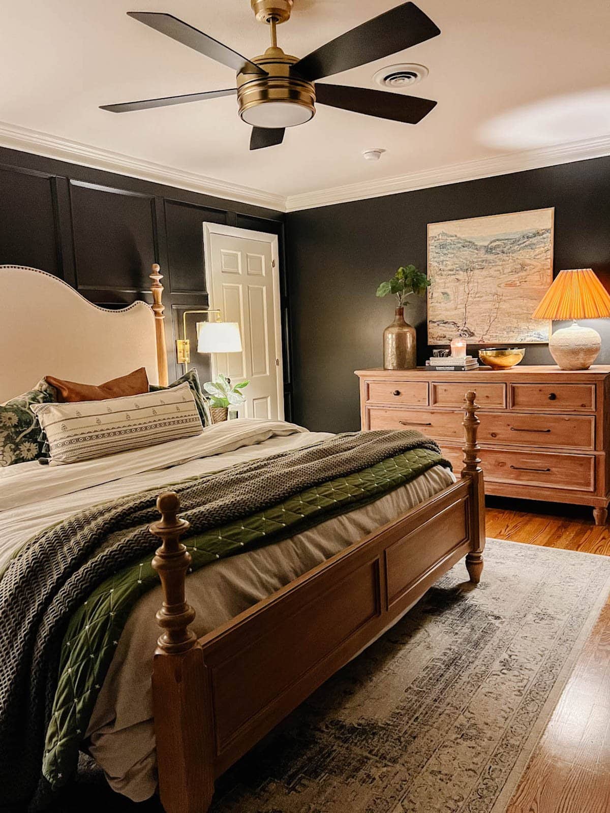
16. Not Decluttering Toys or Having a Toy Storage Solution
If you kids have lots of toys that are taking over your house, try rotating them. Put 1/3 or 1/2 of your kids’ toys in a storage bin or two to place in a closet or the attic and rotate their toys every 3 months. You’ll have less clutter and your kids will be more excited about their toys because it’ll feel like getting a new set every few months.
We try to declutter our kids’ toys to donate especially before Christmas and birthdays.
Consider using furniture with lots of storage and using bins or baskets for smaller pieces. These toy labels for non-readers can help. I love using these storage furniture pieces from Amazon.
Related: Secret Toy Storage in the Playroom + the Chicest Amazon Storage Furniture

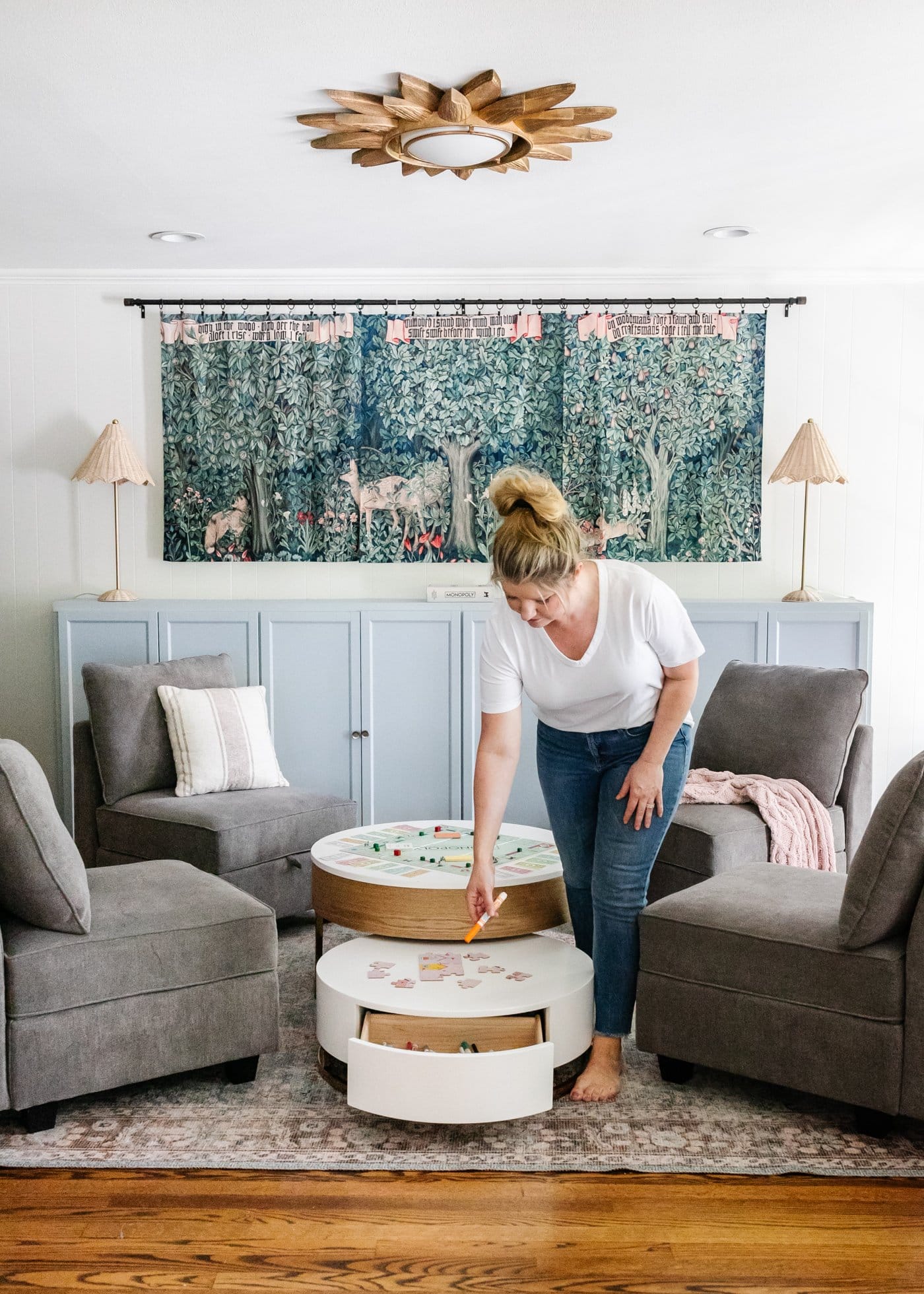
If only I figured out all of these things before I started on this decorating journey…
But then again, that’s the fun part of the adventure. We all have to start somewhere. Make mistakes, figure out what speaks to you, and keep going with what you love. The rest will follow.
If you have any others you’d add, leave them in the comments! Maybe it’ll save us from other mistakes we might look back at and cringe.


