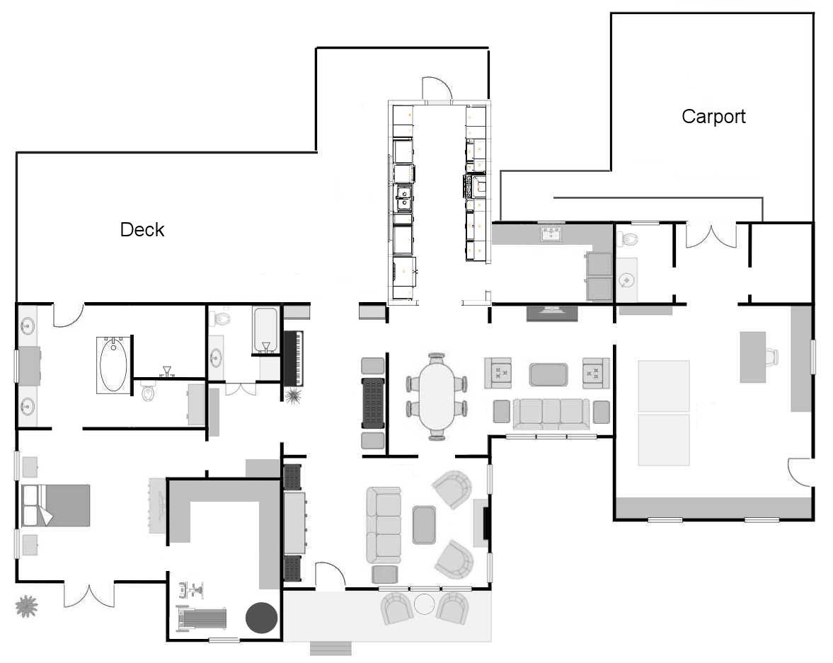
I have a meeting scheduled with the contractor in seven days to discuss our kitchen addition, and I feel like I’m further away from making a decision now than I was last Friday. I’ve come up with two very different kitchen layouts, and to be quite honest, I love them both. I think I would be quite happy with either one. One is much smaller than the other. One is a big rectangle, while the other is a long galley kitchen. One only extends to the back of the current kitchen, while the other extends to the back of the current kitchen and music room. And both of them have pros and cons. So let me show you these two very different kitchen ideas.
The Smaller Galley Kitchen
This was my original idea that I shared last Friday when I shared our overall plan for the house now that we’ve cancelled the big addition. Basically, this kitchen would be a long galley kitchen added to the back wall of our existing kitchen. The existing kitchen will become a dining room.
This kitchen is approximately 10′ x 20′, so 200 square feet. Here’s the general floor plan of just the kitchen provided by the IKEA kitchen planner. If you turn this image 90 degrees to the right, you’ll have the correct position to overlay onto the house floor plan above.

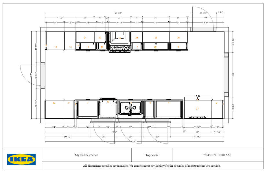
So on the kitchen floor plan drawing above, the cased opening on the right leads to the dining room (i.e., current kitchen). The doorway on the wall to the right of that leads to the laundry room (i.e., the current pantry). And the door on the left wall leads outside to the deck. That door is also very close to the end of the wheelchair ramp from the carport, so I would a walkway of some sort from the wheelchair ramp to the back door of the kitchen.
So with those explanations, here’s one more look at the overall floor plan and the layout of the kitchen. On this one, I just copied and pasted the IKEA kitchen planner floor plan onto my house floor plan.

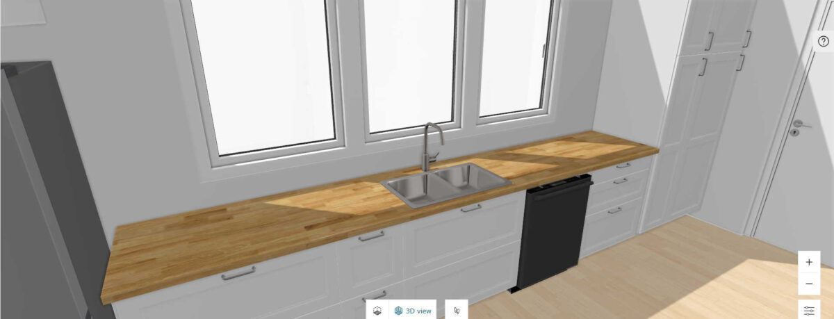
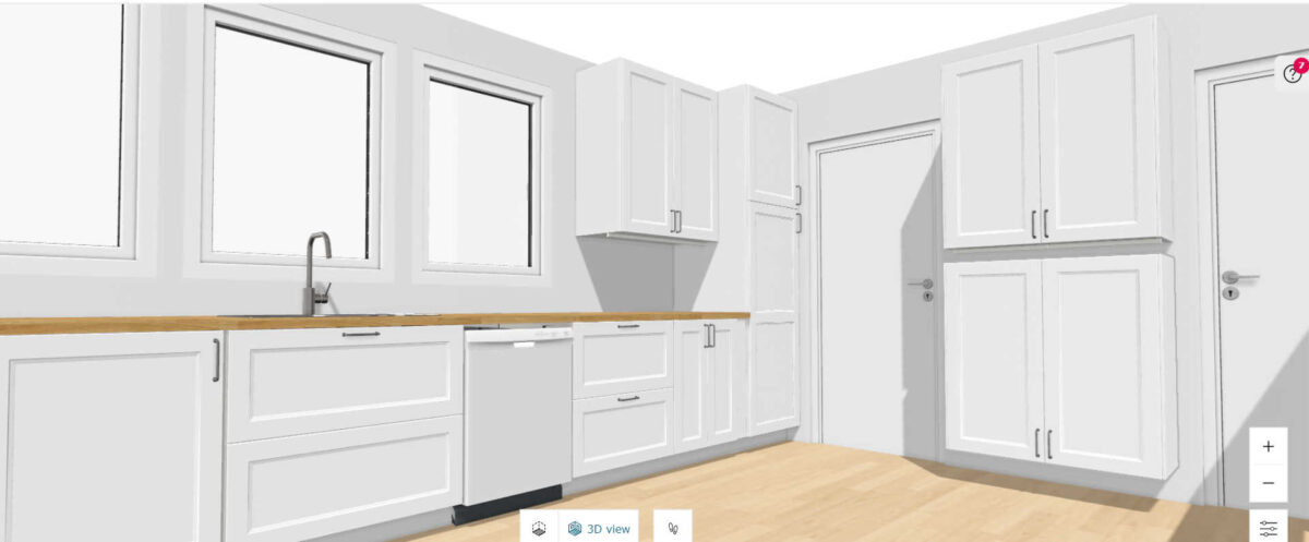
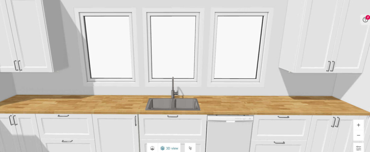
Here are some screenshots from IKEA’s kitchen planner of this layout. The sink would be on a wall of windows that looks out to the deck.

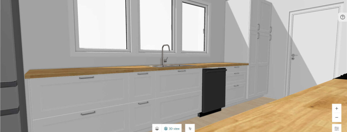
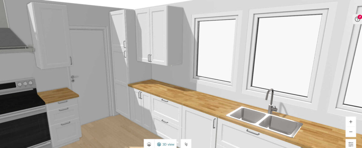
The doorway at the end of the kitchen that leads outside would have glass in it so that it would let in some light. I’d probably use a 9-lite door like we have in our bathroom, and like I also have on the side door of the studio.

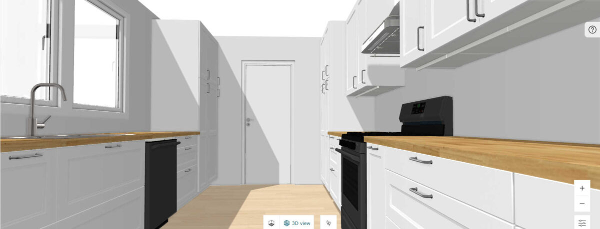
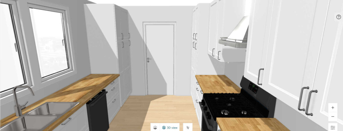
I don’t have all of the cabinet details worked out (i.e., how many drawers I want in each cabinets, and what sizes of drawers I want where). I can work out those details later. But I do envision having the tall pantry cabinets with pull-out drawers on the exterior door end of the kitchen.

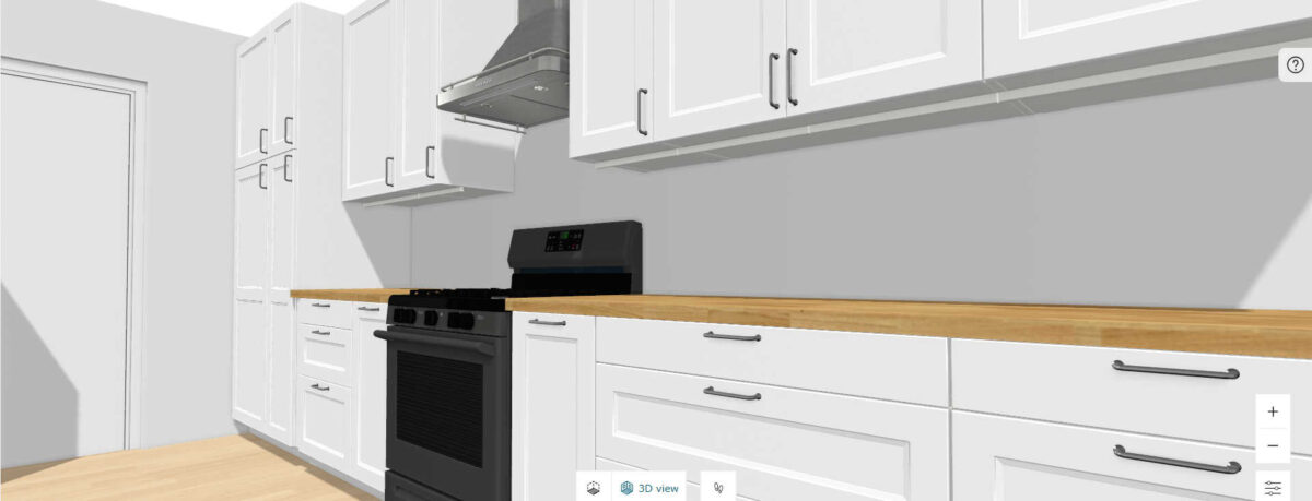
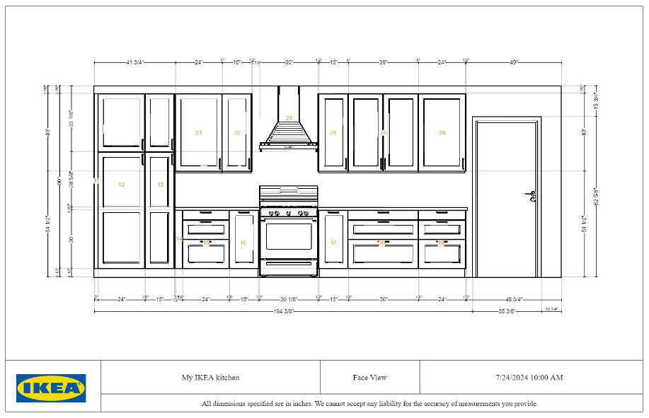
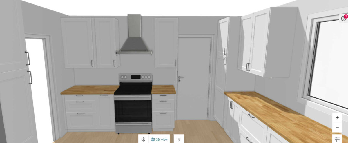
Here’s a view of the range wall, which is the wall on the right side when you walk into the kitchen from the dining room. The door on the right would lead to the laundry room.

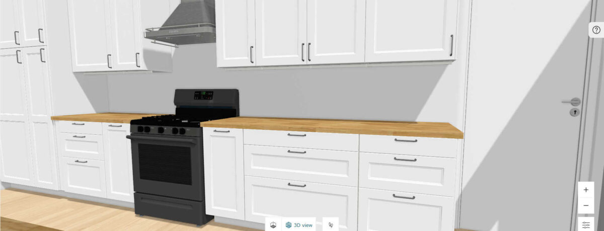
And the looking back the other direction, this is the cased opening to the dining room. I definitely want a cased opening instead of having it completely open to keep things consistent with the rest of the house.

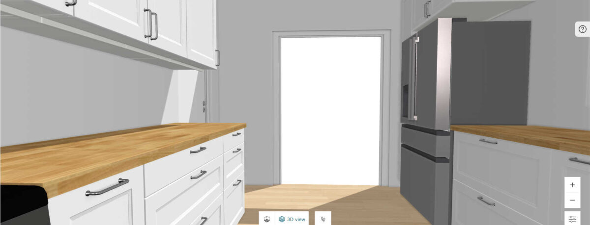
I put the fridge just inside the kitchen for easy access.

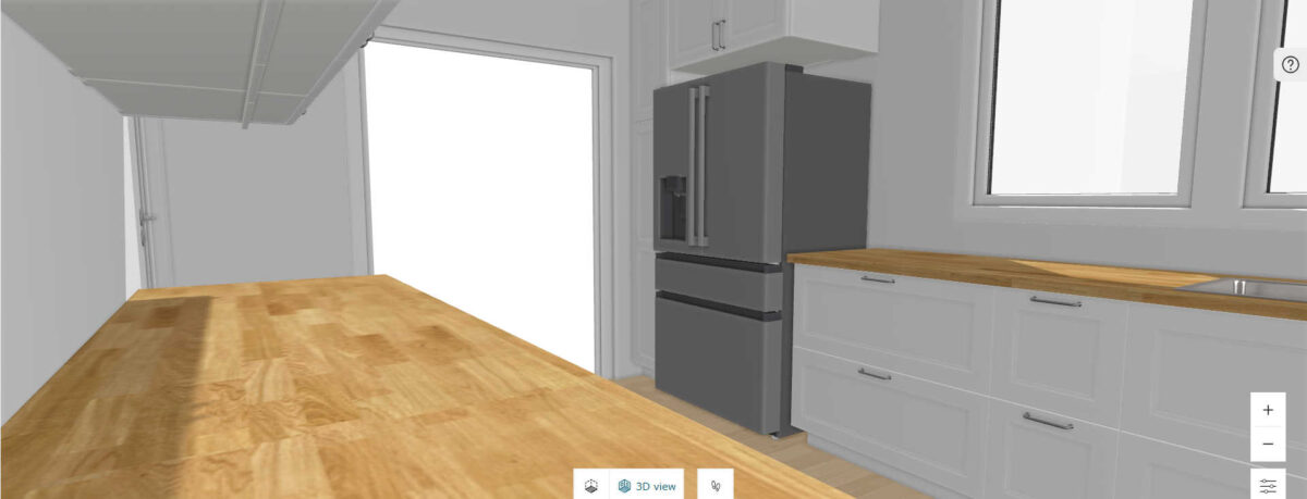
Here’s a little bit of a higher sight angle of the sink wall with the windows.

And one more higher view looking towards the exterior door, which, again, will have glass to let light in.

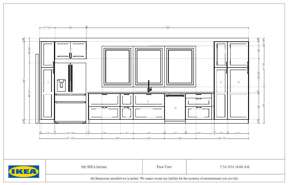
And here are the two 2D drawings of each wall provided by the IKEA kitchen planner. First up, here’s the sink wall with the windows.

And here’s the range wall with the laundry room door on the right side.

And now here’s the second possibility…
The Larger Rectangle Kitchen
This kitchen is 21′ by 13′, so 273 square feet. This kitchen extends to the back of the dining room (i.e., current kitchen) AND the music room. On our floor plan, it looks like this…

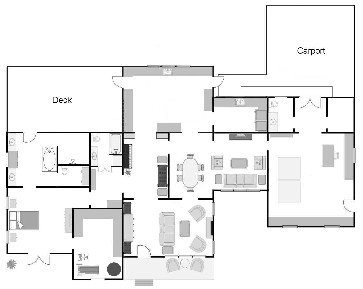
And here’s the floor plan of just the kitchen from the IKEA kitchen planner.

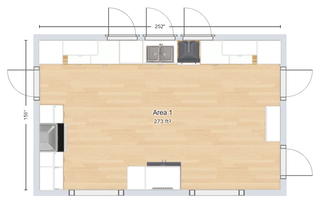
Obviously, this kitchen is bigger, so it allows for quite a bit more storage. Maybe that’s good, or maybe that would just temp me to accumulate stuff I don’t really need. I don’t know. But it is a much more open plan. Our current sunroom extends back 13 feet, so this kitchen would be the same. That helps me to get a good idea of what this kitchen would feel like.
So here’s a look around. You might have to refer back to the floor plan above to get your bearings. From this view, the cased opening on the left goes to the dining room, and the cased opening to the right of the fridge goes to the music room.

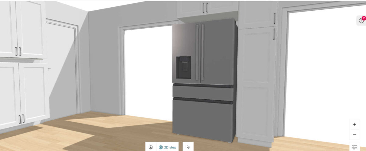
On this wall there are two doorways. The one on the right is the laundry room, and the one on the left is an exterior door that leads to the carport wheelchair ramp. That door would have glass to let light in.

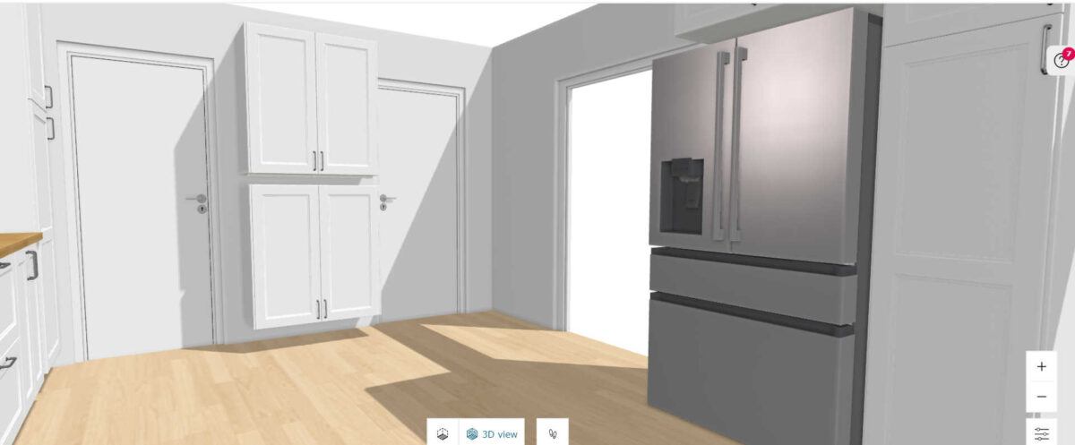
And of course, I put windows on the sink wall. No matter which design I go with, I will have lots of sunlight. This design allows me much more room for the tall pantry cabinets with pullouts, which I put on either end of the sink wall. I would also use upper cabinets to create a shallow storage cabinet unit on the wall between the two doors, just like I did in my studio with the paint swatch cabinet.

And of course, I had to make this wall symmetrical.

And then here’s the other end of the sink wall, with more tall storage and the exterior door that leads out to the deck.

And finally, the range is on the wall to the left when entering the kitchen from the music room.

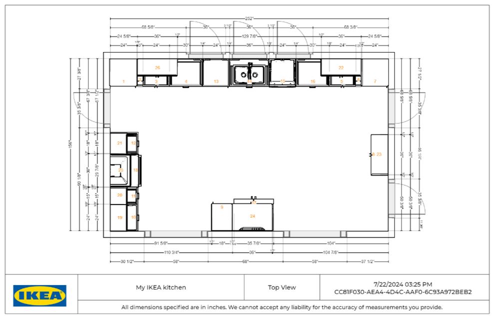
Here’s the kitchen floor plan from the IKEA kitchen planner.

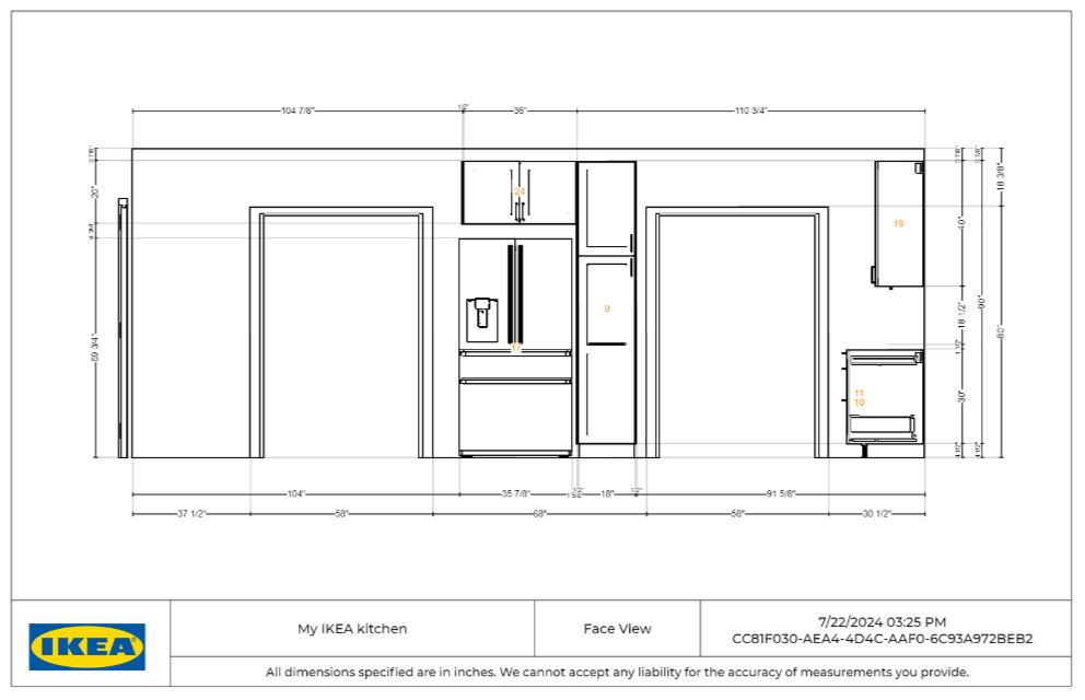
Here’s the 2D drawing of the refrigerator wall with the cased opening to the dining room on the left, and the cased opening to the music room on the right.

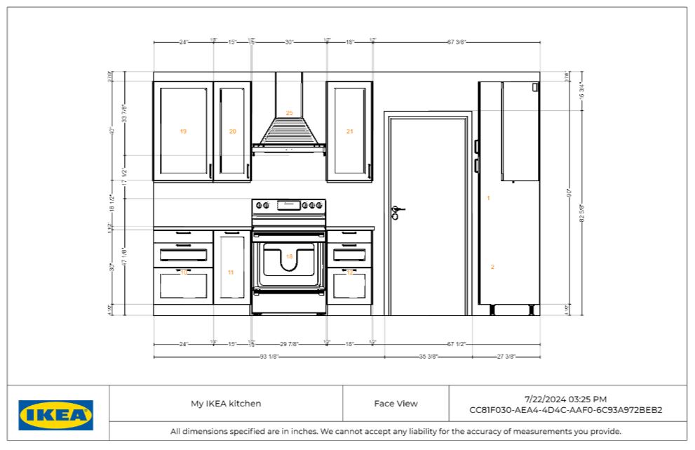
This is the range wall with the exterior door to the deck, which would have glass to let light in.

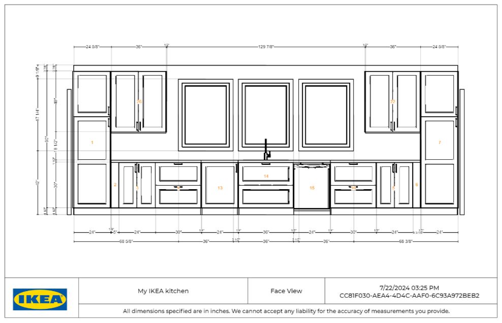
And finally, this is the drawing of the sink wall with the windows and tall storage on the ends. Again, I haven’t thought through every detail of how many drawers I want, and what size drawers I want where, so pay no attention to those details right now.

Before I even start thinking about those details, I just need to make a decision on which kitchen layout I want. I need to have a decision before meeting with the contractor next Tuesday. So it’s either a smaller 200 square foot galley kitchen, or a larger 273 square foot open rectangular kitchen. There are things that I love about each one, and things that I don’t love about each one. If you were in my shoes, which one would you choose?
Addicted 2 Decorating is where I share my DIY and decorating journey as I remodel and decorate the 1948 fixer upper that my husband, Matt, and I bought in 2013. Matt has M.S. and is unable to do physical work, so I do the majority of the work on the house by myself. You can learn more about me here.

