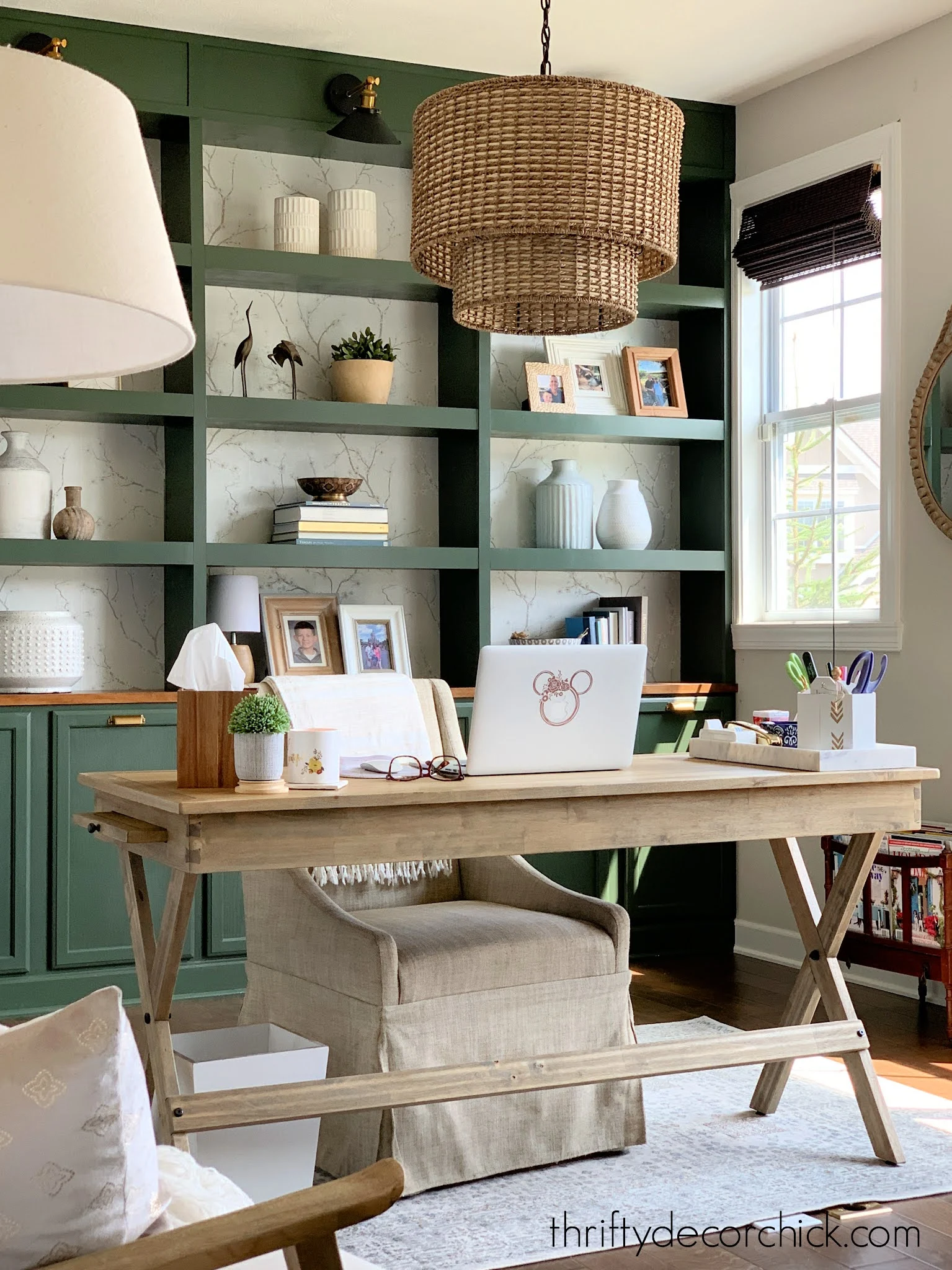
The design plan for my color drenched, at-home office update.
I’m finally starting my office makeover that I’ve had in mind since this
time last year! I’m excited to make this room even warmer and cozier.
If you’ve read TDC for a while, you know I tend to slow down in the summer.
I did some research a few months ago and am quite sure I have summer
Seasonal Affect Disorder.
For as long as I can remember, I lose my energy and mojo in the heat. The
sweating, humidity, bugs (mosquitos LOVE ME), the heat…it drains
everything out of me.
But once these slightly cooler days hit, I feel like myself again! I am
happier, more energized and ready to tackle new projects! I love fall so
very much.
I accomplished a bunch of DIY projects before the summer, and this office
redo is the first I want to tackle in the second half of the year. I hate to
call it a redo…I’m just adding to what I’ve already done.
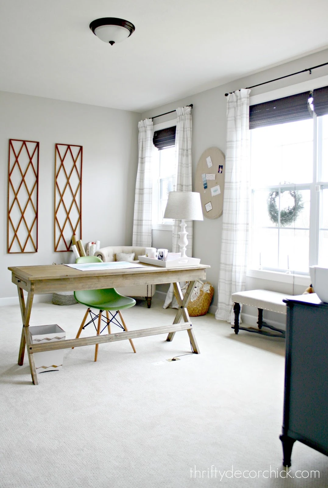
This room started out very pretty and light, but there wasn’t a lot going on
design-wise:
This post may contain affiliate links for
your convenience.
I may earn a small commission when you make a purchase through links.
Even before we moved in, I had my furniture layout set in my head. I wanted
to float my desk in the middle of the room and build a wall of bookcases on
the wall behind it.
That pretty green paint color is called Vintage Vogue and it’s from
Benjamin Moore.
My plan for phase two of the space is to add some drama. Because this
room gets so much natural light, I feel comfortable going darker on the
walls.
I’ve been craving a richer, library look in here for quite some time. An
office is the perfect room for a moodier vibe!
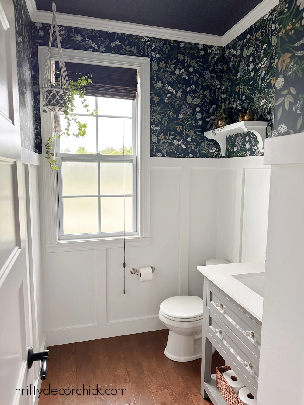
I’ll be installing wainscoting along the bottom third of the walls. This
time my plan is to do a more elaborate take on this board and batten look in
our powder room:
But of course in the dark green, Vintage Vogue color. My hope is to add a
more custom look with some additional molding around the trim work. I think
it will look very library-esque with the added detail!
I want to break up the dark color on the walls a bit though, so my first
step was to find the perfect wallpaper for the top two thirds of the
walls.
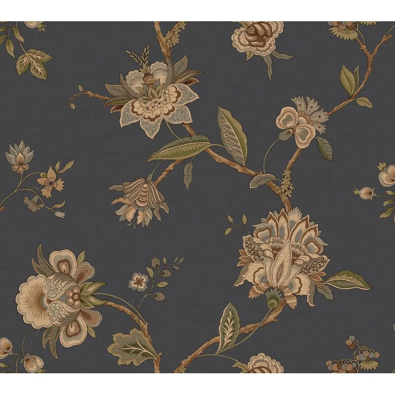
It was so beautiful and it looked like the green would match the built ins
perfectly.
Unfortunately, the blue background was much lighter than what’s pictured
online. I was so bummed, because I really loved that deep blue color
with the green bookcases.
But the green color was more of a blue green (this is why I wish samples were
always available!). There was no way I was going to repaint the bookcases, and
I didn’t love that green as much anyway.
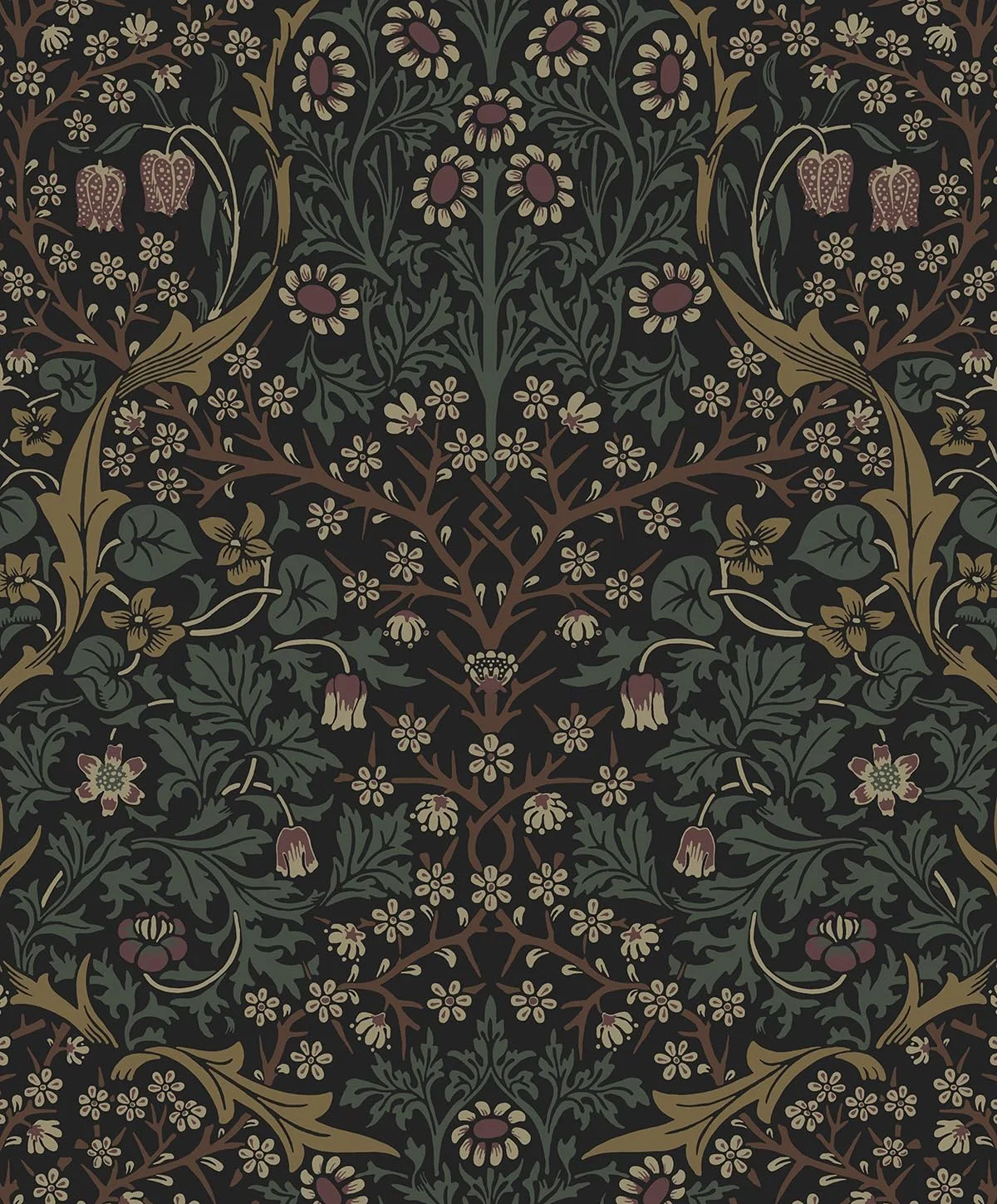
I tried one more version of this design, this time with a green that matched.
But I realized I didn’t LOVE the design as much as I thought I would.
And it was going to be SO expensive to cover just the top section of the
walls.
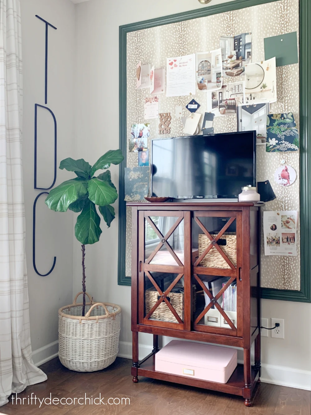
I love the antelope design on that fabric, and the busy wallpaper wasn’t going
to work with that, the art or the drapes in the room.
I don’t want to have to change much that’s already there, just add to it!
🙂
SO. I took a step back and decided to go with a more understated but classic
look. Something that was more neutral and would work well with the other
designs in the room.
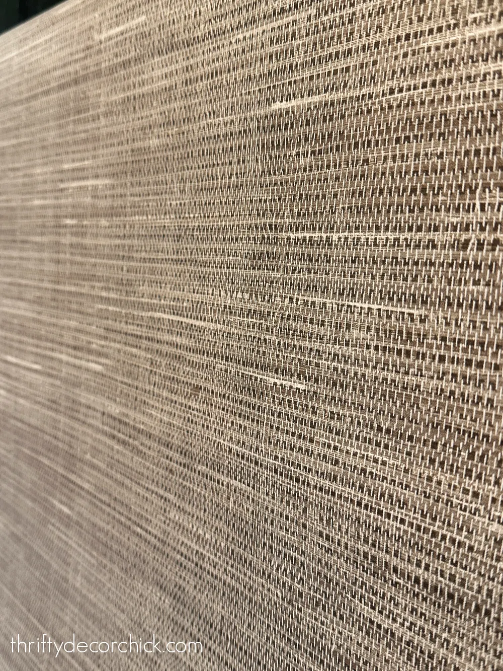
I love the warmth and texture…it’s going to be perfect!
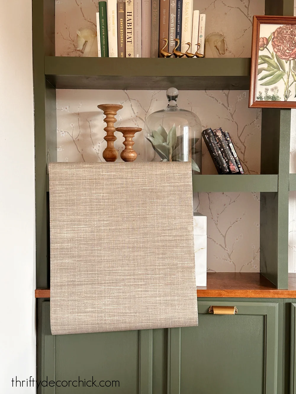
It has a slight green tone to it that looks GREAT with the green
bookcases:
Oh, so much better! It gives me that library feel, but I can still decorate
around it easily. I really love it.
This wallpaper is similar to gray grasscloth I used in our bedroom, in that
it has a slight texture to it. It looks like true grasscloth
wallpaper, but a fraction of the cost of the real thing.
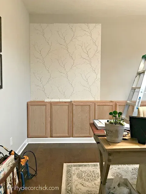
Before I built the shelving for these bookcases, I installed a pretty
cherry blossom peel and stick wallpaper (in the neutral color) on the wall:
It’s so lovely, but I’ve really been wanting to simplify that end of the
room. My plan is to remove the existing wallpaper and then paint the backs
the same color as the built ins.
I’ve slowly been starting this process over the past week. It’s been very
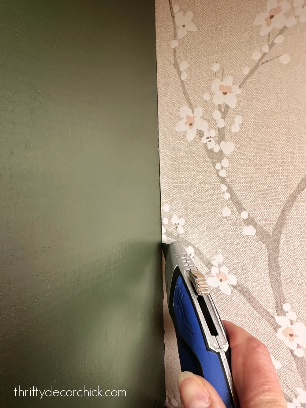
easy and quick thankfully! I use a sharp razor blade to lightly score around
the edges of the wood, against the walls:
Thankfully, the wallpaper has come off of the walls pretty well.
I always install wallpaper before building bookcase shelves. It
takes a fraction of the time compared to after they are finished, and is
still easily removed.
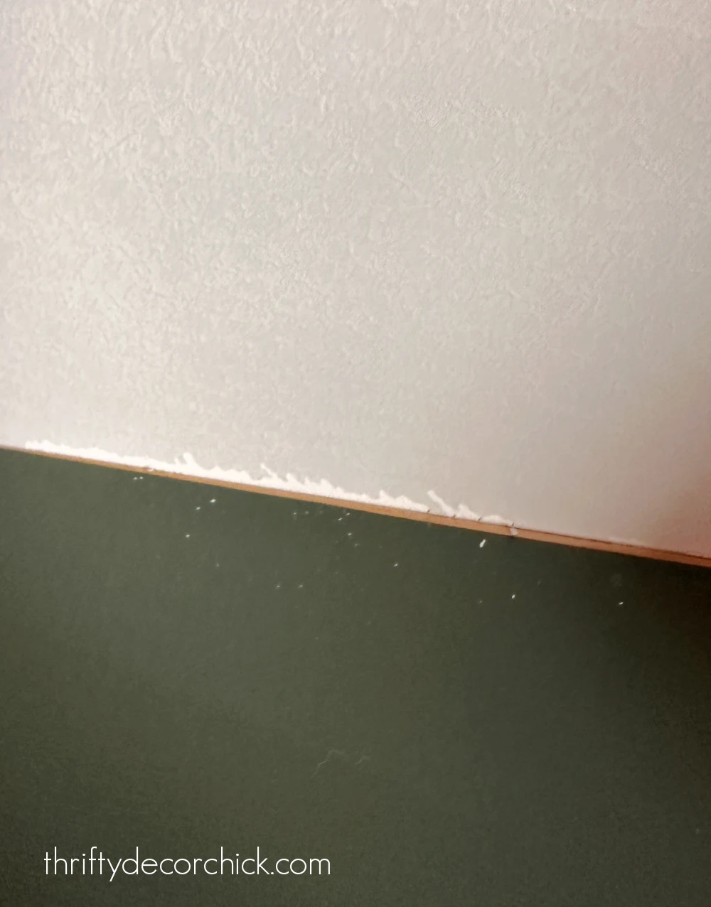
I’ve had a couple very small areas where the drywall pulled away a bit, but
that’s because I pulled at the wallpaper too quickly:
This part of the project won’t cost me a dime, since I have extra paint to
finish off the bookcases.
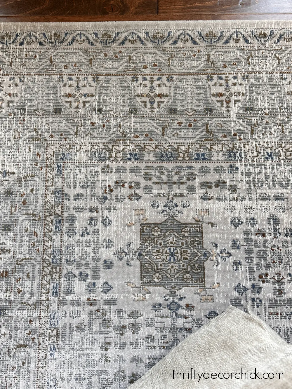
The only big item I hope to purchase for this upgrade is a new rug. I LOVE
the one I have, but I’d like it to be a little bigger:
I got this smaller one at At Home years ago, but can’t find it online
anymore. I really hope I can find a bigger size in this same design.
I have an outlet in my office floor, so I’d have to cut a hole in it
somehow. I think I can figure that out.
Otherwise, the lighting and drapes will stay the same. I’ll probably add to
the decor on the bookcases a bit, but overall this is going to be makeover
on the walls almost exclusively.
I can see it in my mind and I can’t wait to start sharing the progress! I’m
energized now that it’s not 95 degrees anymore! 🙂
Do you get your energy in the warm weather or cooler months?

