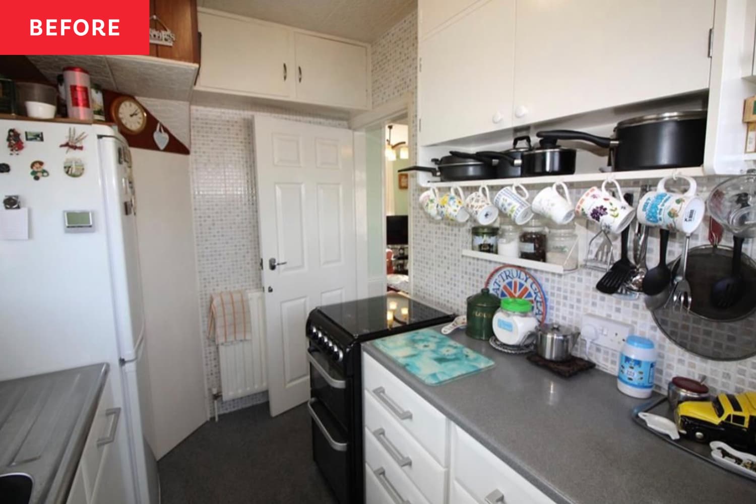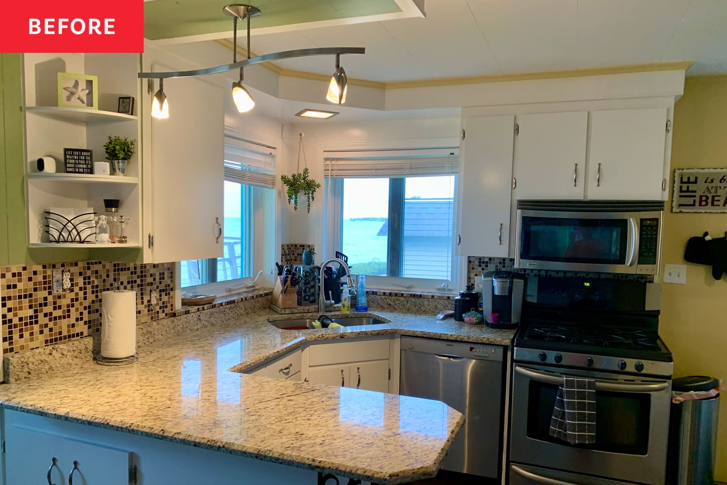
A word of advice: Don’t be afraid to purchase an older home with dated stylings, because it’s amazing what some clever renovations can do. DIYer Debra Cagigal showed how to modernize a dated kitchen on a budget during the Spring 2024 One Room Challenge.
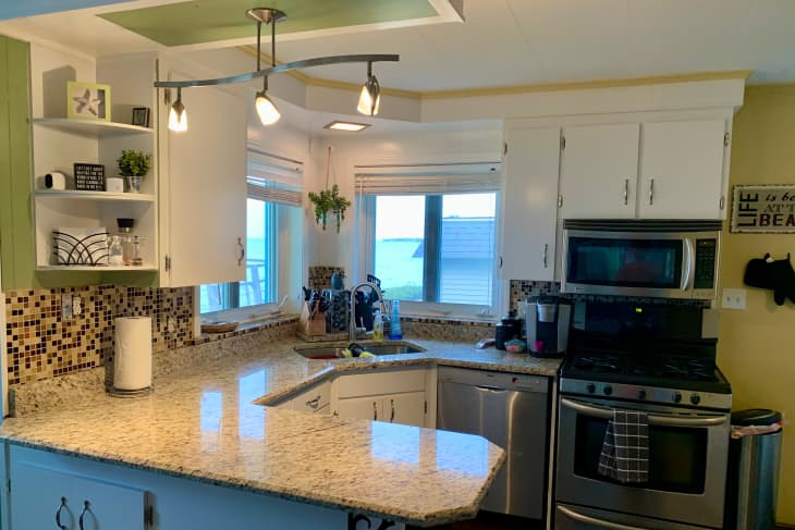
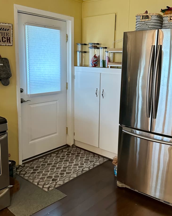
Although Debra’s home was repainted around eight years earlier, her kitchen was still stuck firmly in the mid-1990s. Its original color scheme was full of brown and yellowish tan, with “plain white cabinets and silver accents,” as well as a lack of adequate storage. However, she was charmed by its two large windows, which made the room “bright and welcoming.”
Nevertheless, “the tan and brown hues made the space feel dull,” Debra says. Her goal was “to illuminate the space and establish a unified design and style.” Here are several ways she gave her home a much-needed modern makeover.
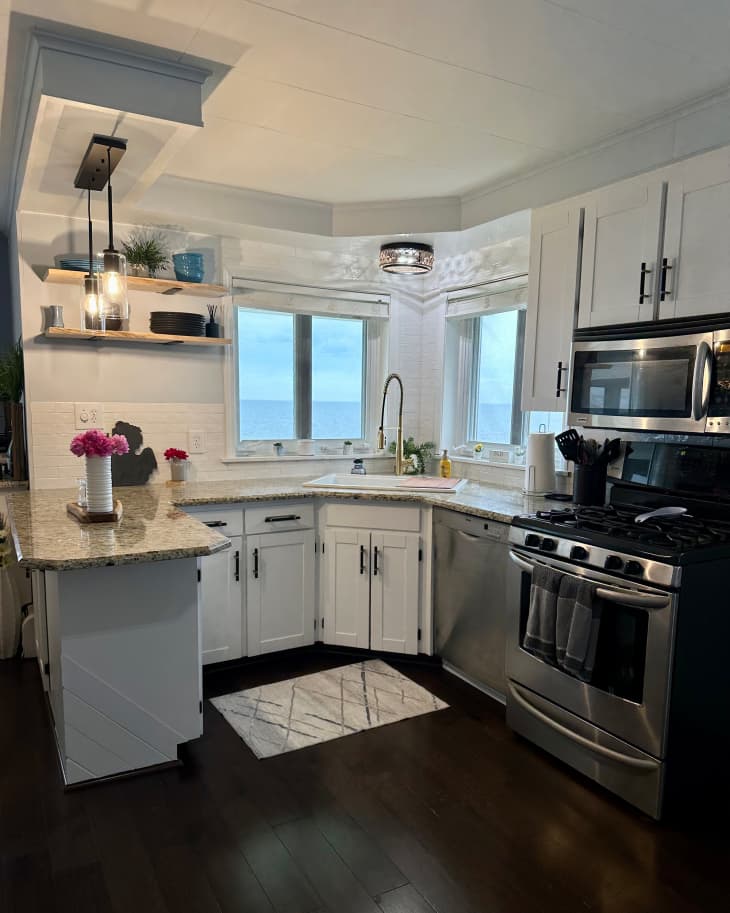
Removing the left-hand upper cabinet made the kitchen feel airier.
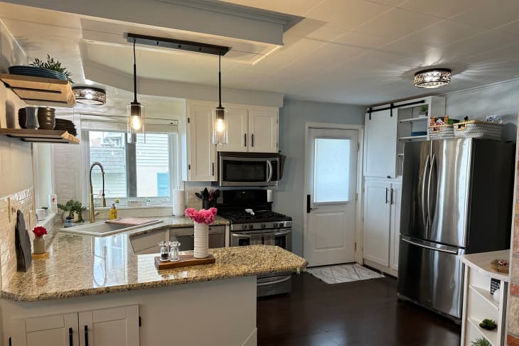
To kick off the renovation, Debra decided to get rid of the large upper cabinet on the left side of the sink as well as the adjoining shelving. However, upon removing the cabinet, she discovered a hole in the kitchen ceiling and paneling, rather than typical drywall. To make matters more complicated, Debra also found a cinder block beyond the kitchen’s original paneling and had to dismantle the 50-by-50-inch wall and install new drywall.
“Consequently, I reinforced the structure, installed new drywall, and patched everything up to mount my DIY live-edge shelves successfully,” Debra says. Her shelving is made from Northern Maple and feels more light and airy than the clunky unit before. “Removing the cabinet significantly opened the space,” Debra says.
The cabinets got a Shaker-style shakeup.
Speaking of the cabinetry, when Debra saw her solid wood cabinet doors, she identified them as “perfect for a makeover.”
“When transforming a piece of furniture or a space, it’s important to recognize that not everything needs to be brand new,” she advises. “With this transformation, I was able to repurpose the solid doors of the cabinets, which I estimate saved me at least a couple hundred dollars.”
She gave them “a distinctive, Shaker-style facelift” by stripping the original paint using Wise Owl Paints’ GreenEZ Furniture Strip & Clean and adding trim pieces from hardboard from The Home Depot.
The lighting, faucet, and tile got modern swaps.
Debra changed the faucet and flush-mount lights in the space to match the more contemporary hardware. “The gold faucet, centered above a large white sink, is a standout feature!” she says.
She also added a modern backsplash. The old brown and black tile had been installed with adhesive paper around the counter’s edge, and Debra installed new white tiles and grout across the entire back wall.
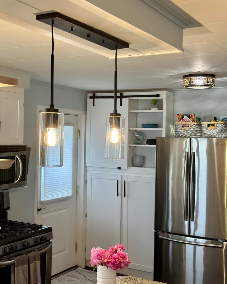
A barn door DIY adds concealed pantry storage.
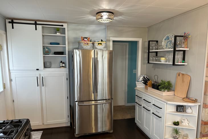
One of Debra’s favorite parts of her kitchen makeover is the pantry glow-up, which adds much-needed storage. Debra decided to expand her pantry by adding additional shelves and enclosing one side with a “quaint barn door, which conveniently concealed the outlet box and some of the shelving.”
When it comes to planning room transformations, she recommends scoping it out for any potential places to add extra storage. “I like to look at the targeted space to see what can be upscaled, renovated, or transformed,” Debra says. “Is there a space that could benefit from additional storage or shelving to assist in any usage needs our family and guests may have?”
NB: Ratingmania is a place to find the finest discounts on the internet and all the necessities.
Source url www.apartmenttherapy.com
Before & After,featured-ba,One Room Challenge,b&a:hometypes:House,b&a:homestyles:Traditional,b&a:ownerships:Owned,b&a:skilllevels:DIY,b&a:projecttypes:Kitchen,b&a:levels:Just Needs Love,b&a:beforeyears:1990,b&a:rentalfriendly:No,Kitchen,team:home projects,platform:social

